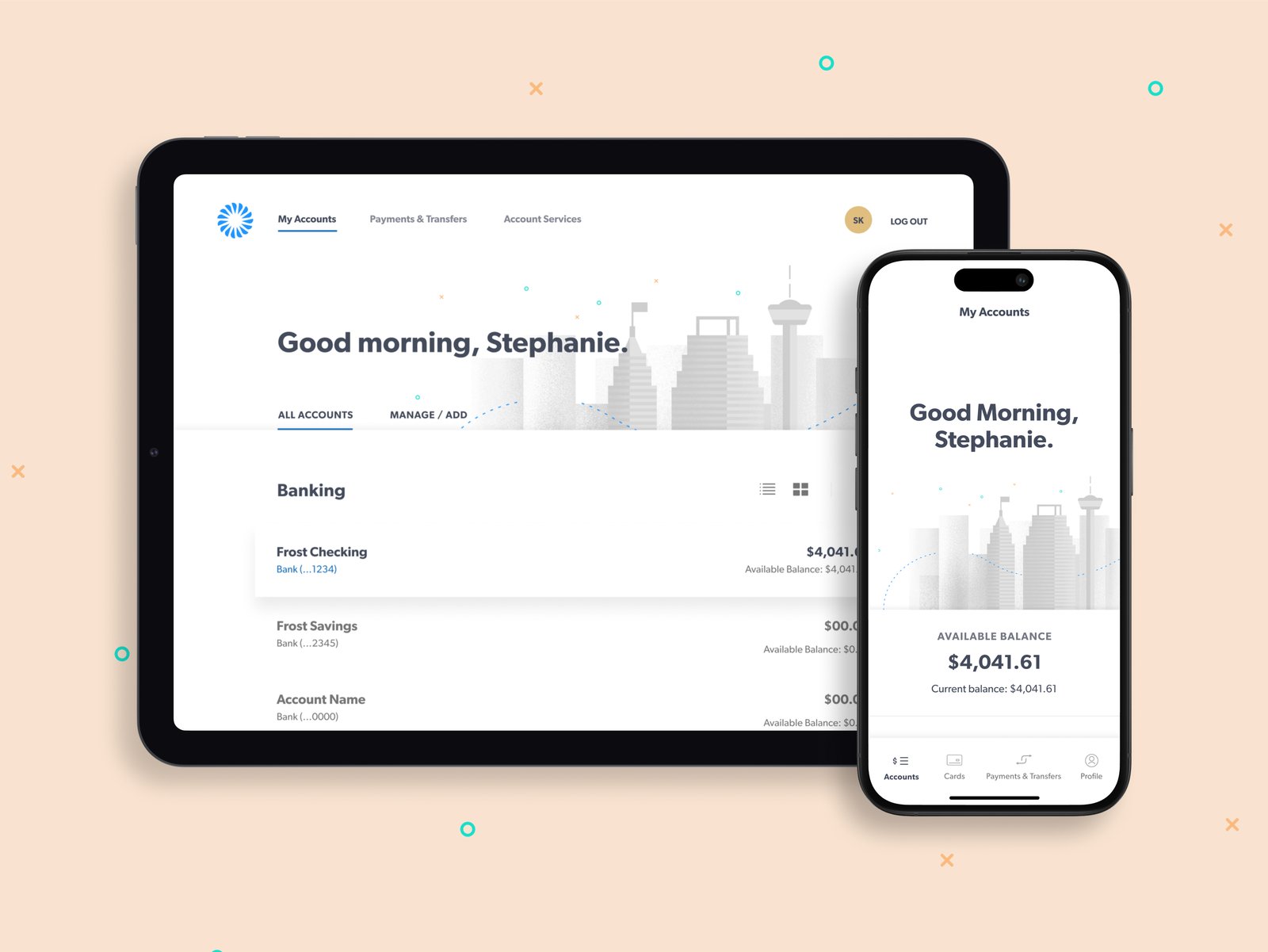
Project · frog + Frost Bank
Our team set out to explore and create a new visual direction for Frost's digital touchpoints. The direction set the foundation for a scalable design language system and helped Frost in re-establishing themselves as a true digital design leader among competitors while taking existing and prospective customers into a new era of personal banking.
Brand Direction
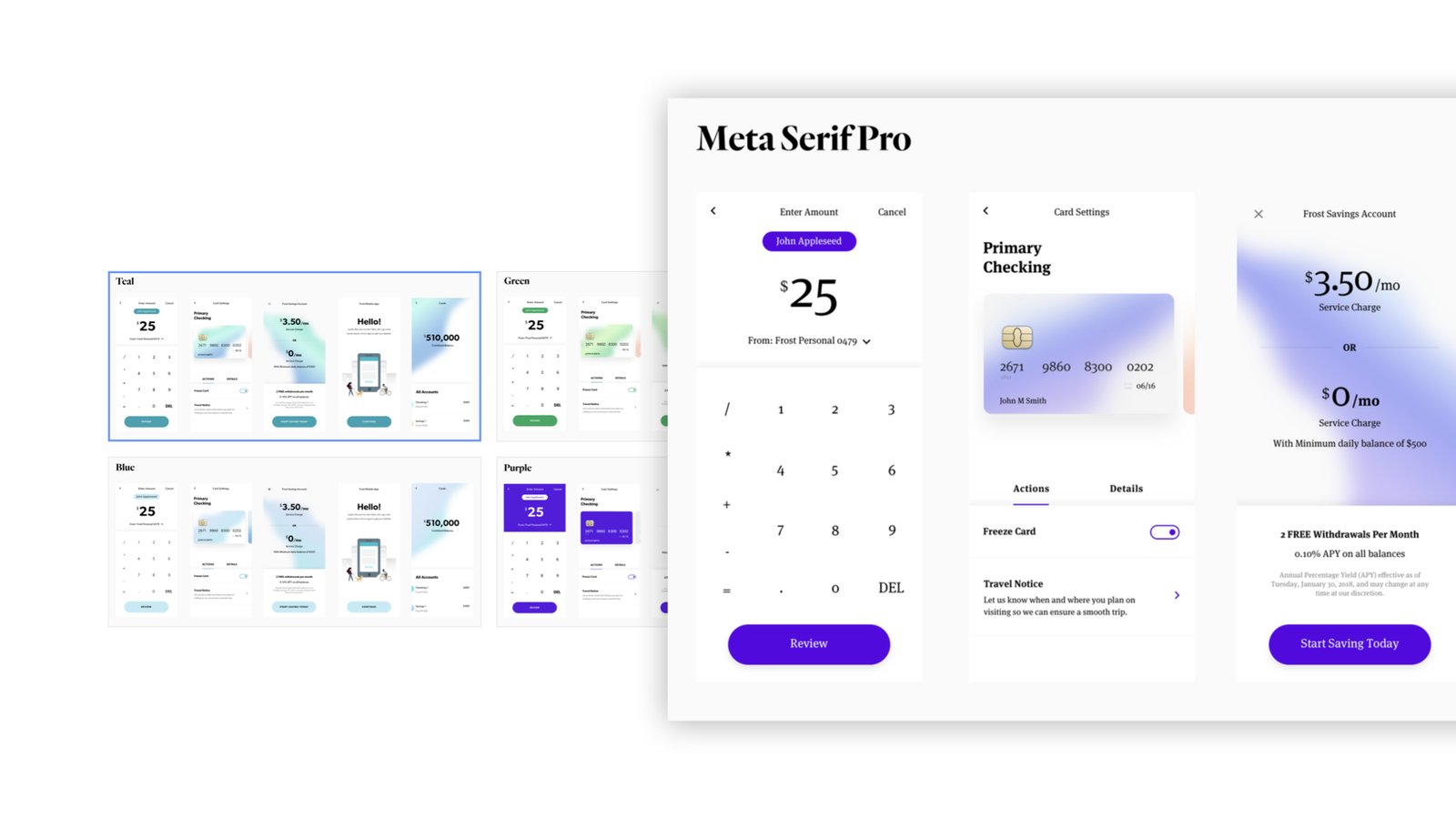
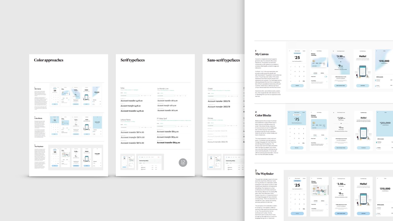
We rebuilt Frost's visual foundation from the ground up, defining a new type system, color palette, and art direction. Every choice aimed to feel modern and unmistakably Frost while honoring more than a century of earned trust.
Design System
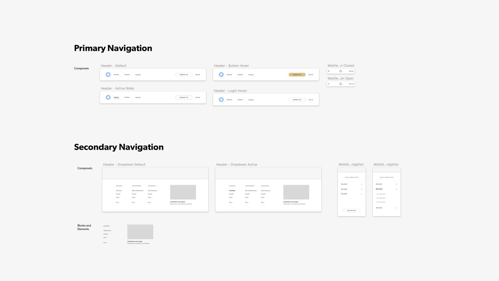
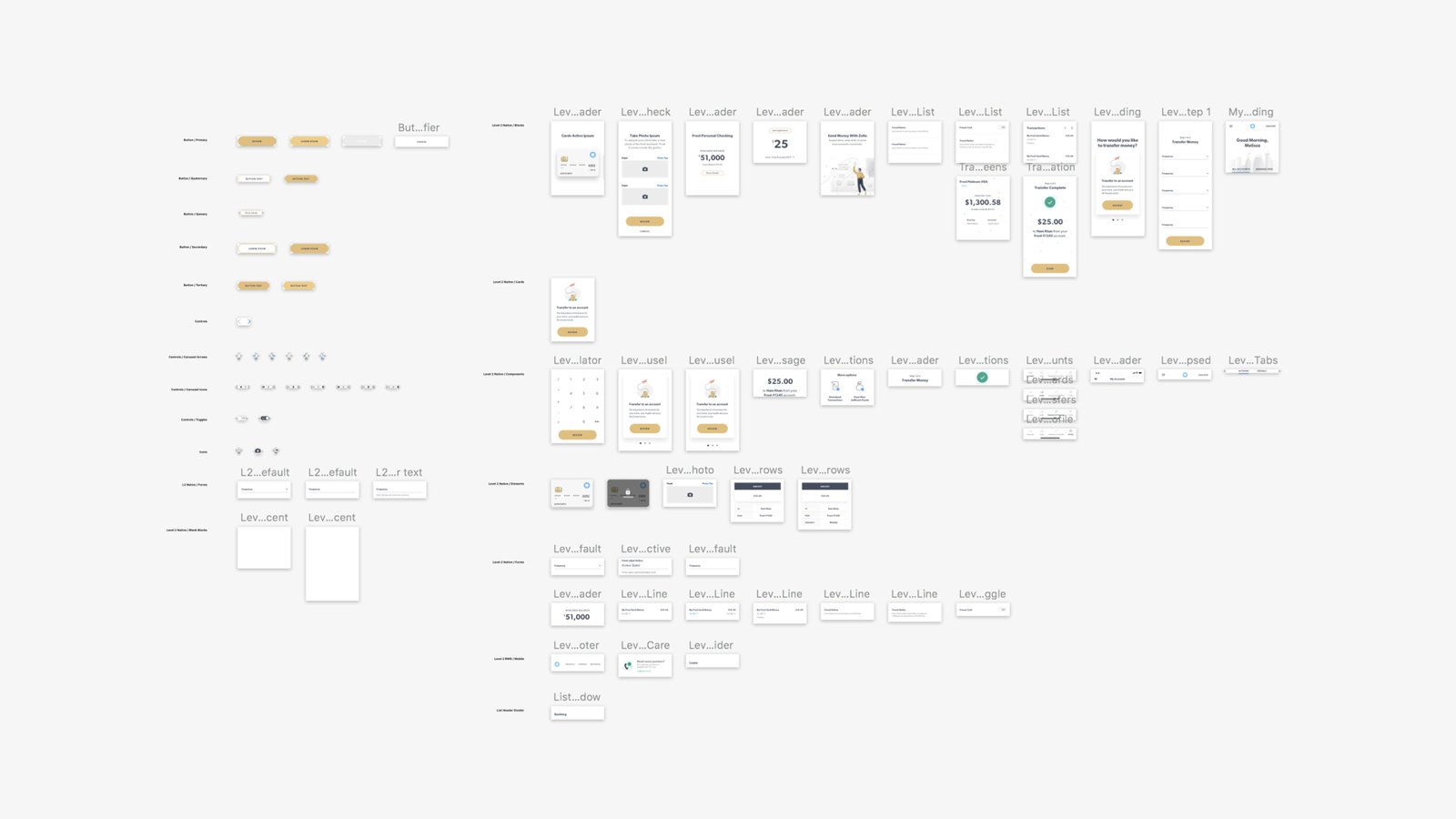
We broke the banking experience down to its atomic elements, then rebuilt them into a unique, reusable UI kit. The result was a flexible system that could scale across products without losing consistency.
Account Overview
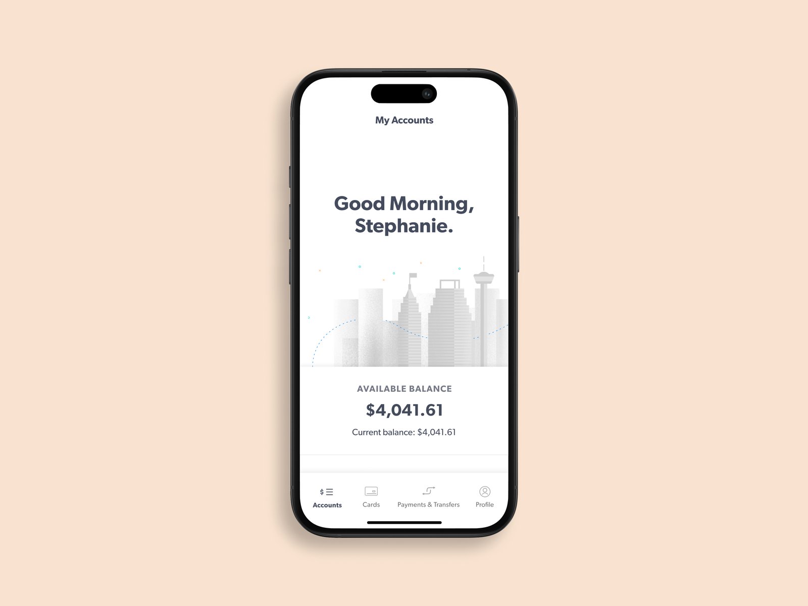
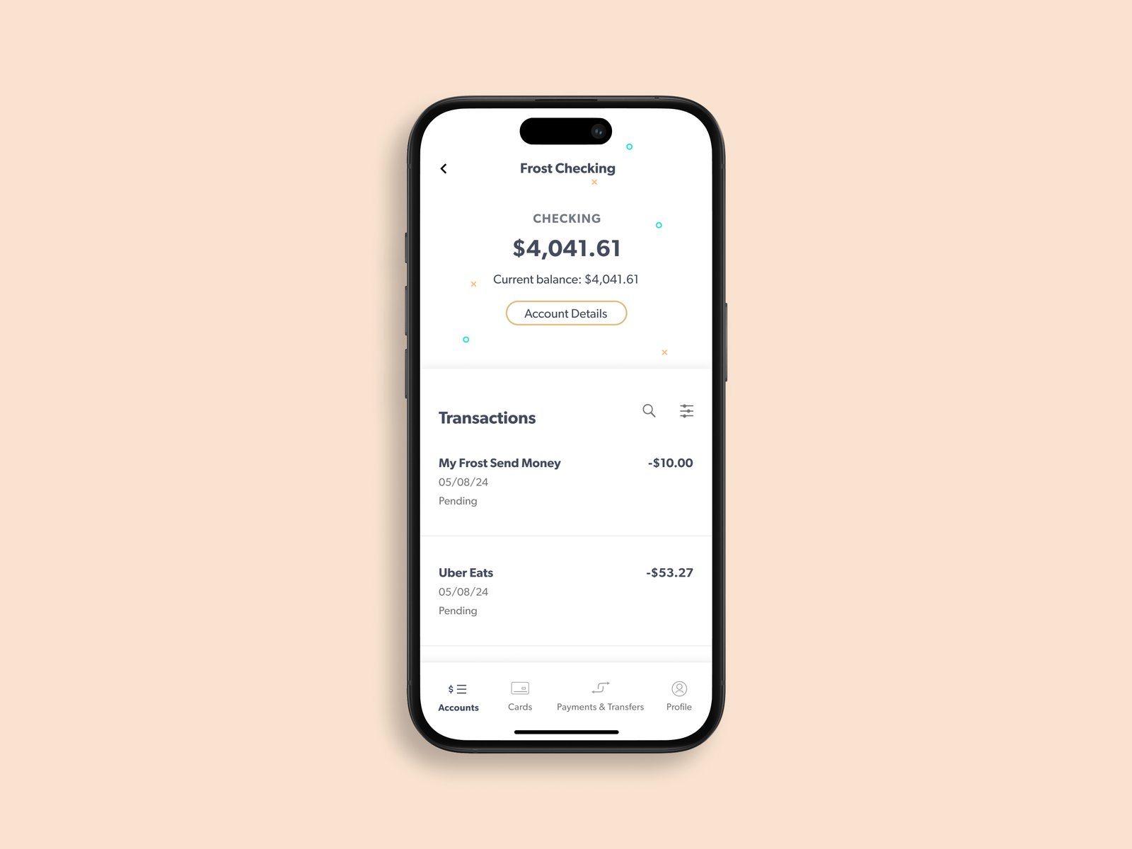
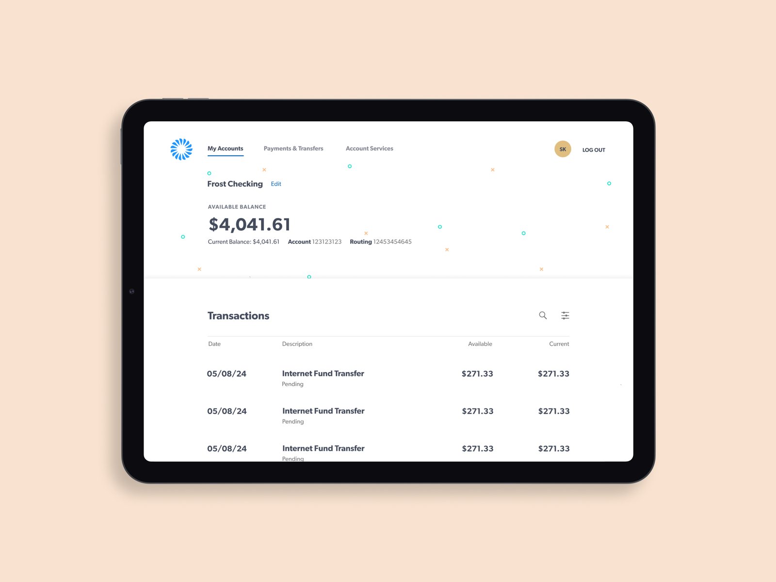
The overview had to make a customer's money legible at a glance, so we leaned on clear typographic hierarchy and generous white space. Balancing density with breathing room let the most important numbers lead.
Card Management
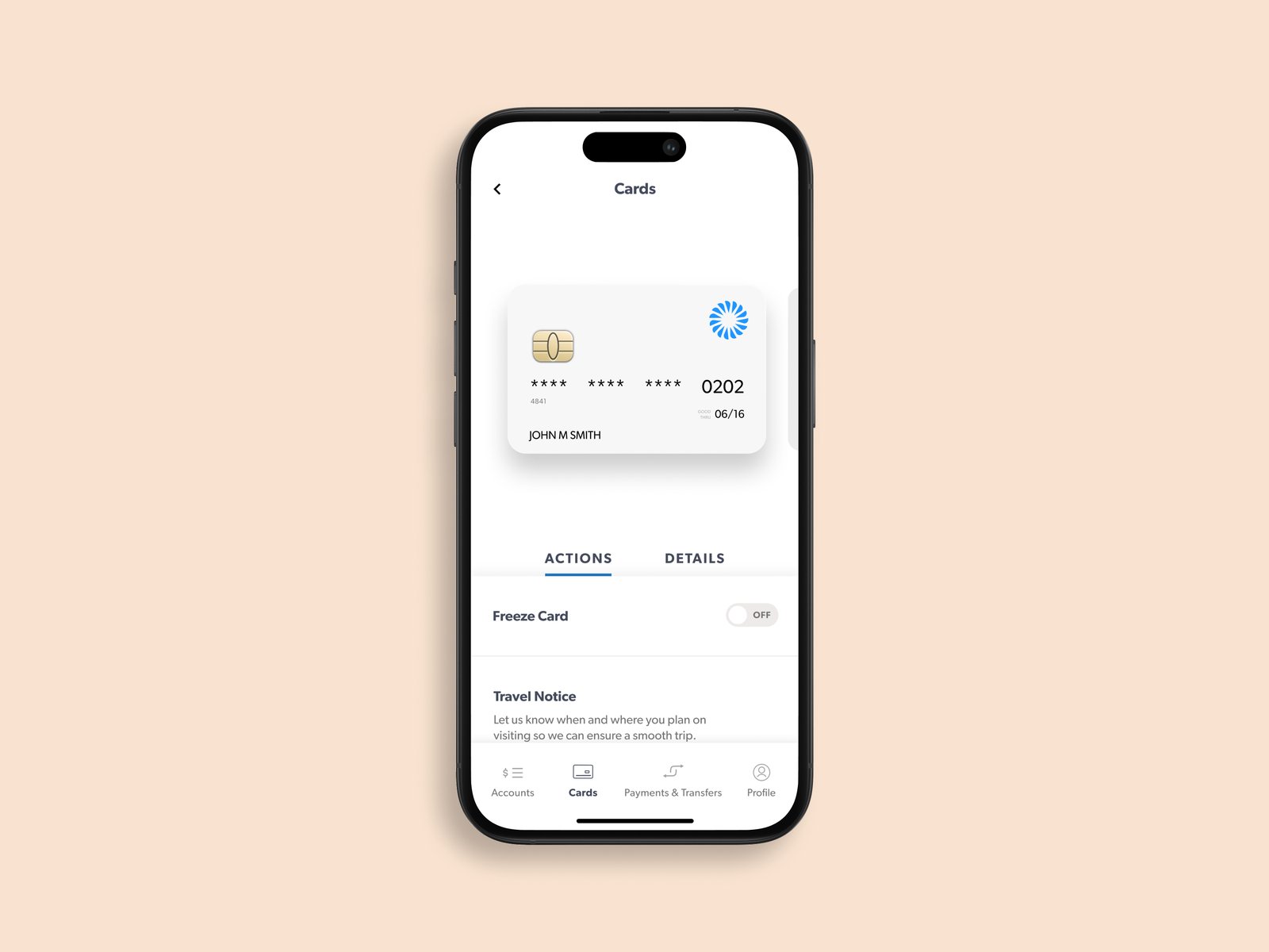
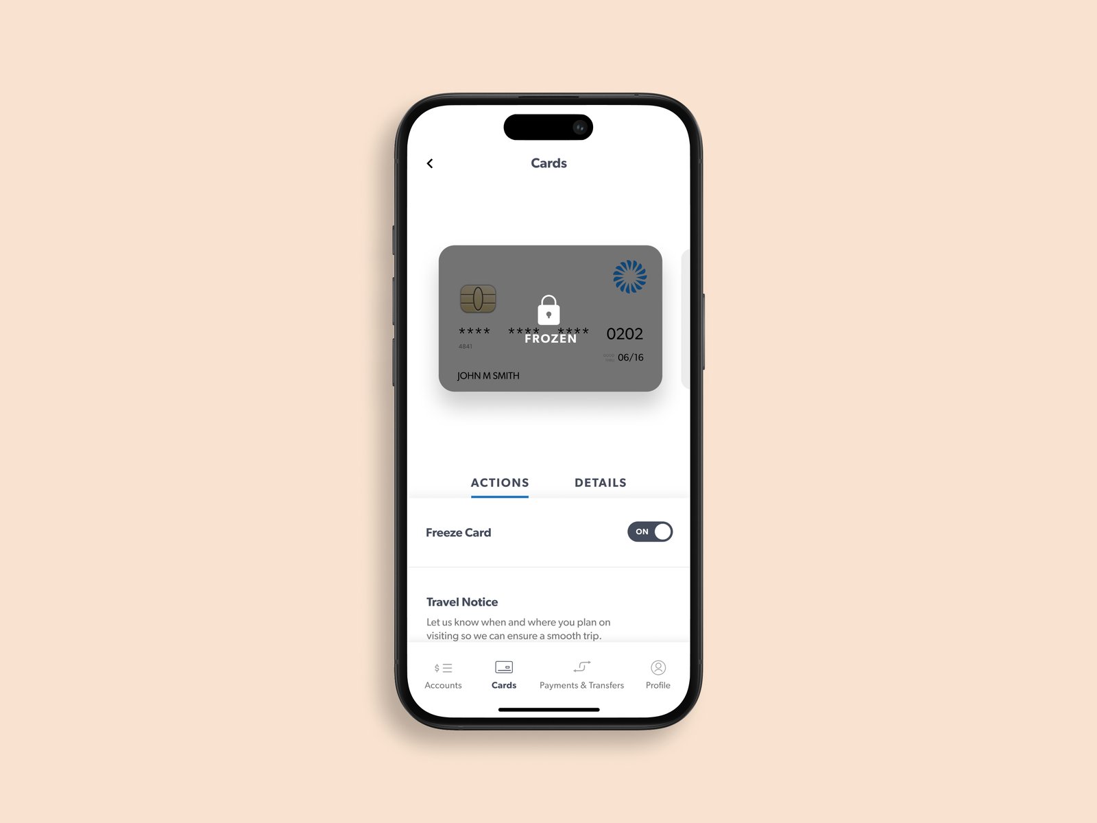
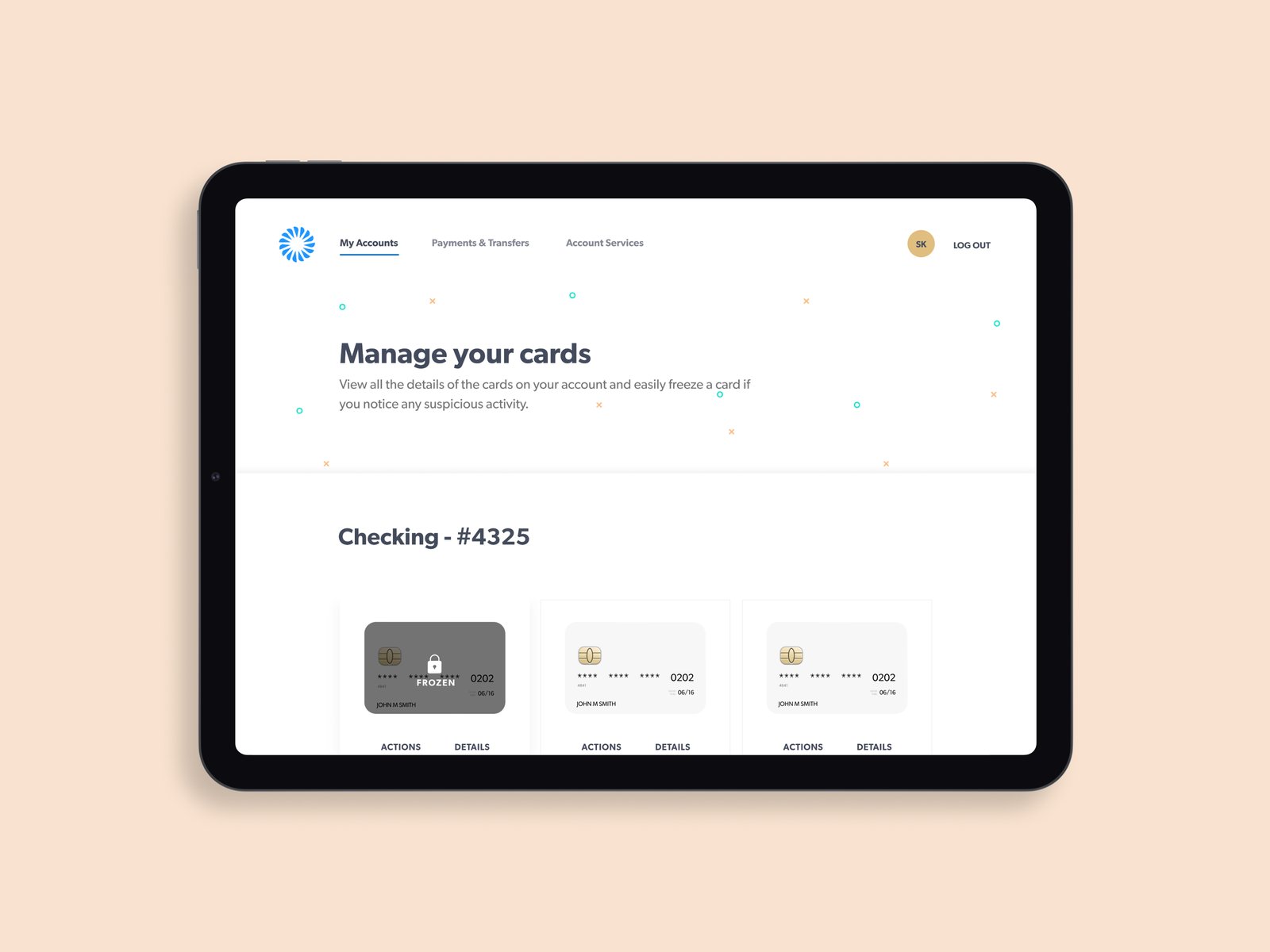
Card management brought details, quick actions, and time-sensitive tips into a single place. We designed it so customers could act fast, freezing a card or checking a charge, without ever digging.
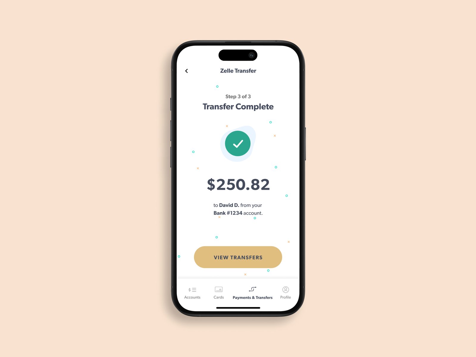
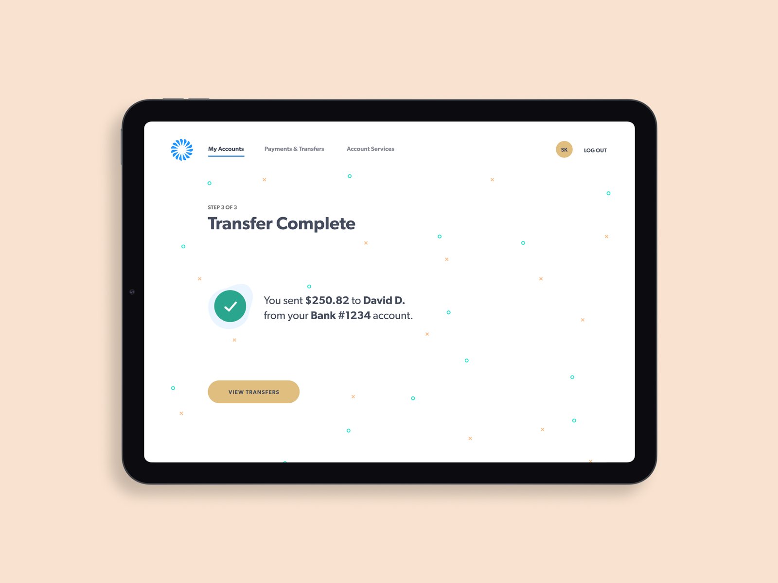
Money Movement
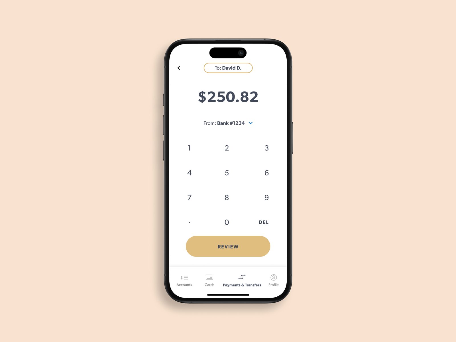
Moving money between friends, banks, and businesses is the heart of any banking app, so every step had to feel effortless and certain. We treated each confirmation as a moment of confidence rather than an afterthought.
Reflection
Working shoulder to shoulder across multiple teams, frog, Frost, and McGarrah Jessee, taught me how much good design depends on shared intent and trust. In just six weeks we built a scalable design language meant to outlast any single screen, and the engagement reinforced a belief I still hold: the strongest work comes from restraint, from knowing what to leave out.
"Perfection is achieved, not when there is nothing more to add, but when there's nothing left to take away."— Antoine de Saint-Exupéry
Happy to talk through the process, tradeoffs, and what I'd do differently.