Case Study · eBay
Reducing friction through simplification and systems thinking
Summary
This project was a foundational effort to modernize eBay's native listing experience by rethinking how sellers create listings.
The project began as a focused effort around Sneakers and Sports Trading Cards, but evolved into a broader initiative that influenced future listing experiences across eBay.
The challenge wasn't simply redesigning a flow, it was simplifying a complex ecosystem while balancing user needs, business goals, and existing system dependencies.
The Problem
The existing listing experience required sellers to begin with Sell Search which asked them to search for an item or a similar item before creating a listing. Research showed this conflicted with sellers' natural mental model.
Sellers weren't thinking "Find an item in a catalog."
They were thinking "I have something I want to sell."
Foundational research revealed nearly half of participants failed to successfully find a match, due to typos, generic queries, incorrect searches, or users intentionally bypassing search.
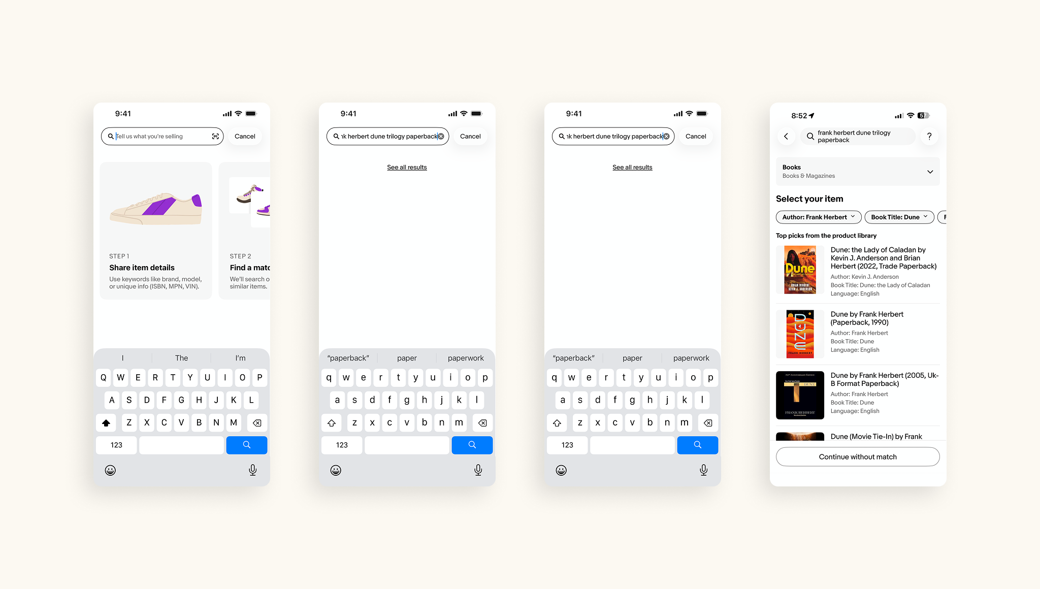
Even when users successfully found a match, they landed in a hub-and-spoke listing summary experience where they frequently bounced between pages editing information.
The experience created unnecessary friction and required sellers to work around the system rather than the system working for them.
Why It Mattered
This work represented more than a redesign of a listing flow. It was a foundational effort to modernize eBay's native listing ecosystem and eventually replace legacy systems.
More broadly, success meant increasing seller confidence, simplifying the listing journey, and improving marketplace outcomes.
Constraints
01
Much of the experience relied on existing catalog systems and recommendation engines. When recommendations became inaccurate, trust decreased, editing increased, and pricing confidence dropped. Price guidance was especially problematic where adjacent items could create large pricing differences.
02
The initiative aggressively simplified the experience. Removing features required balancing usage patterns, revenue impact, user value, and business priorities. Simplification could not come at the cost of meaningful value.
03
Moving from hub-and-spoke toward a wizard flow raised concerns around increased flow length, completion rates, and user friction. The team required extensive validation to ensure the benefits outweighed the added steps.
My Role
I led the end-to-end experience strategy and design for the new listing framework.
Each portion of the flow underwent detailed analysis and reconstruction around simplicity and reduced cognitive load.
After positive metrics from the Sneakers launch, I also built the Sports Trading Card framework, expanded the framework horizontally, and created the latest framework for B2C users.
Key Decisions
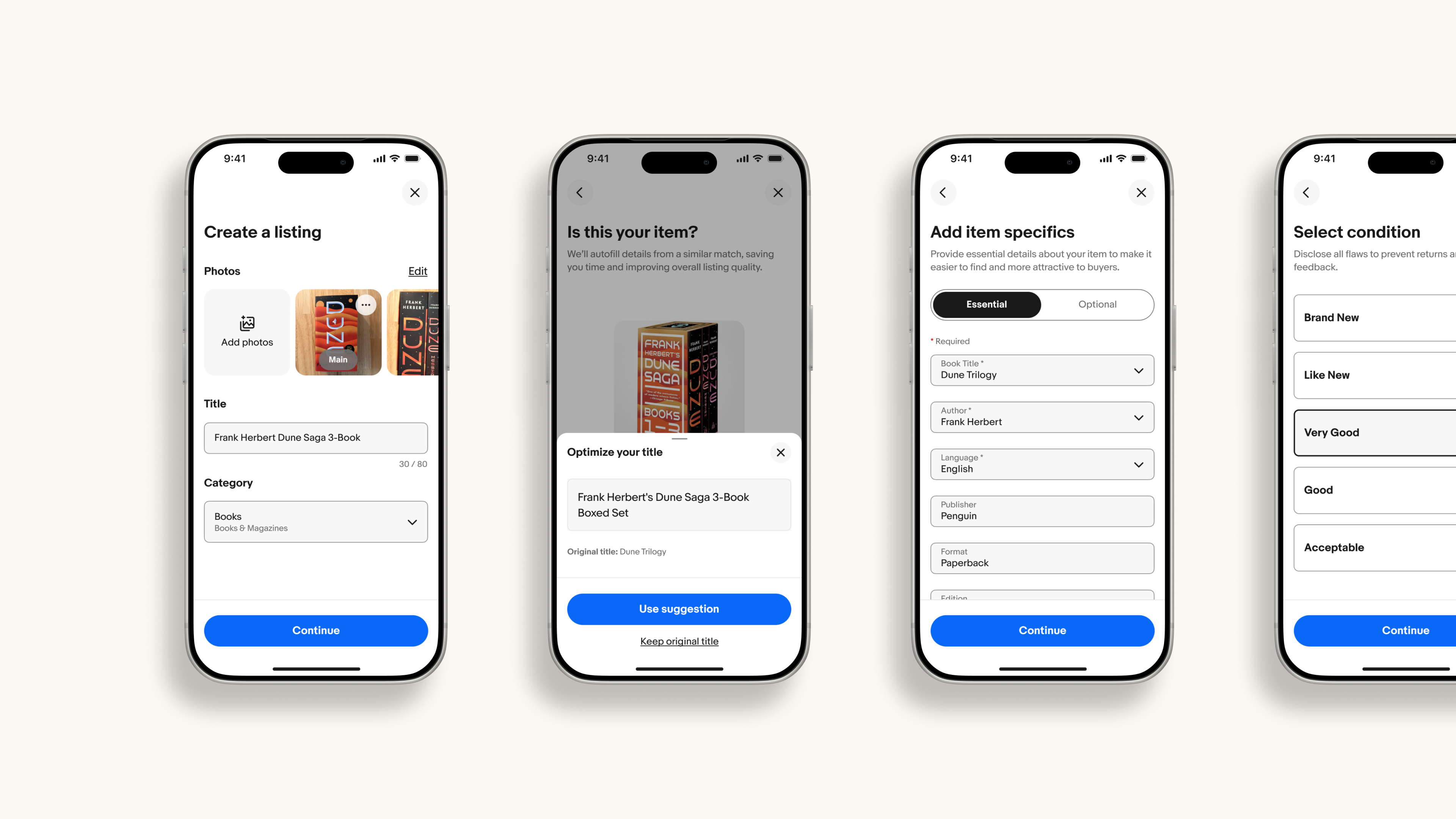
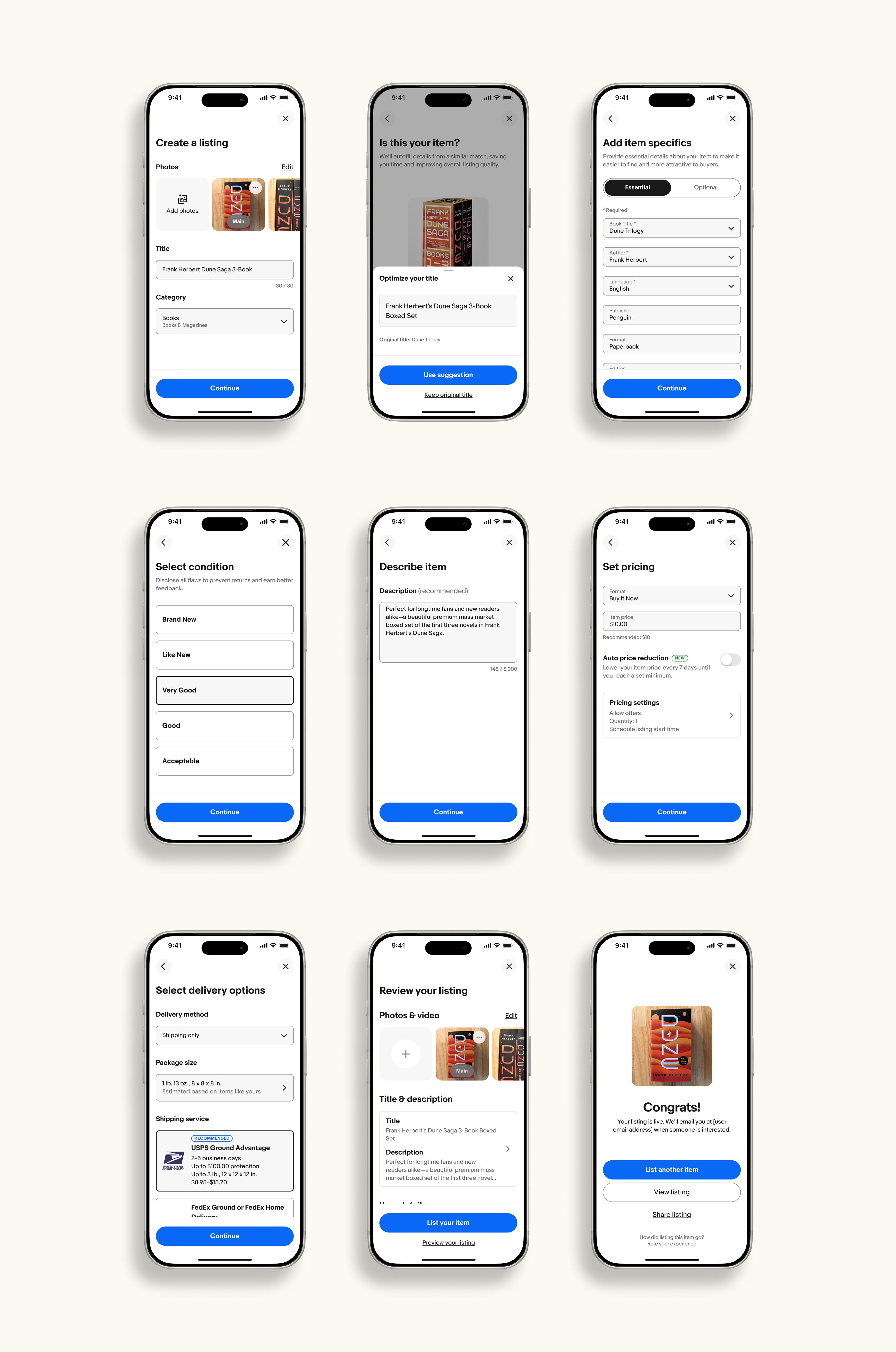
Users could now begin with photos, a title, or a category which aligned more closely with how sellers naturally thought about listing.
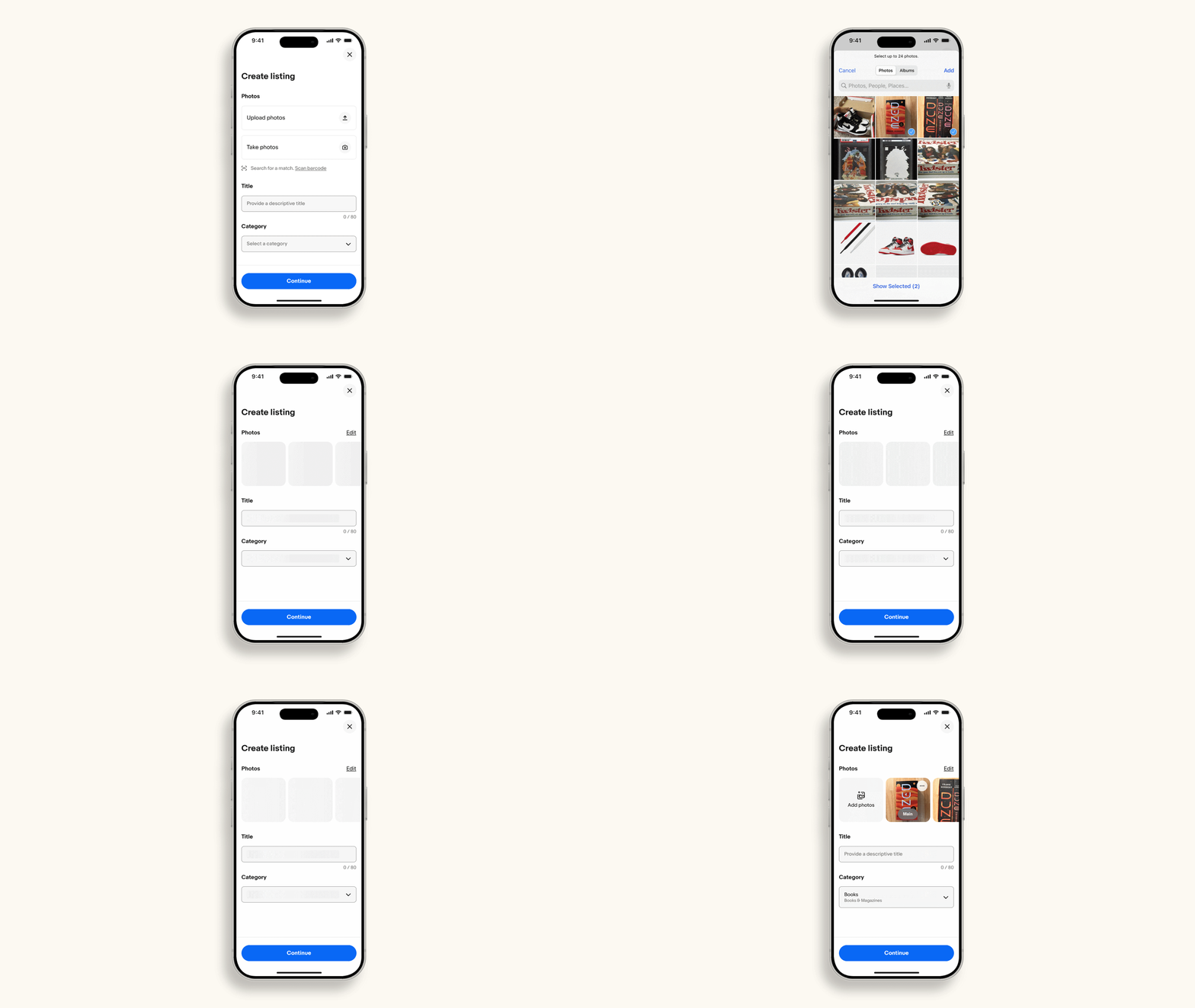
The previous experience required users to repeatedly jump between multiple pages. We redesigned the flow into a guided wizard framework that allowed sellers more focus on specific tasks like pricing and shipping to reduce context switching and cognitive load.
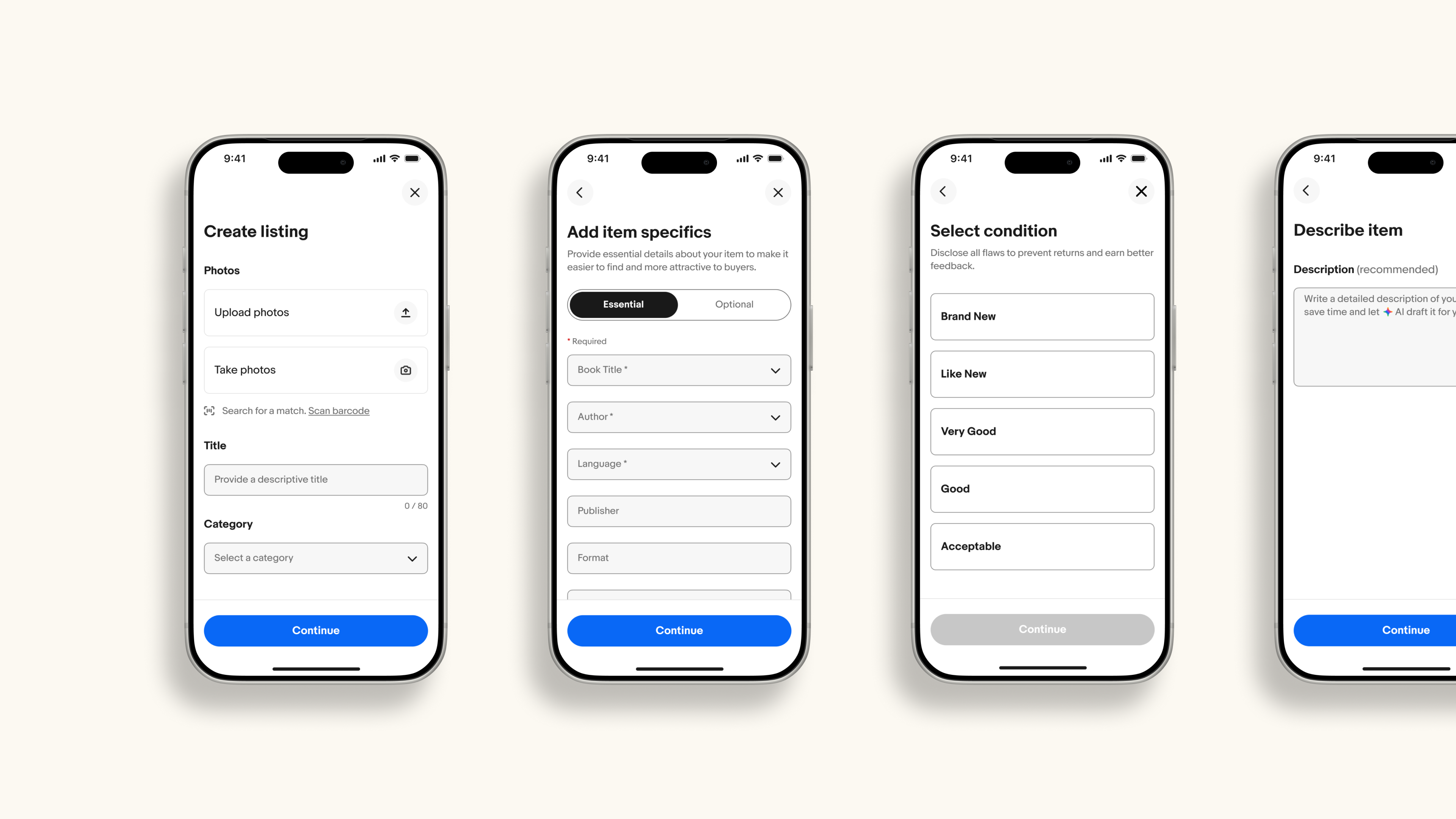
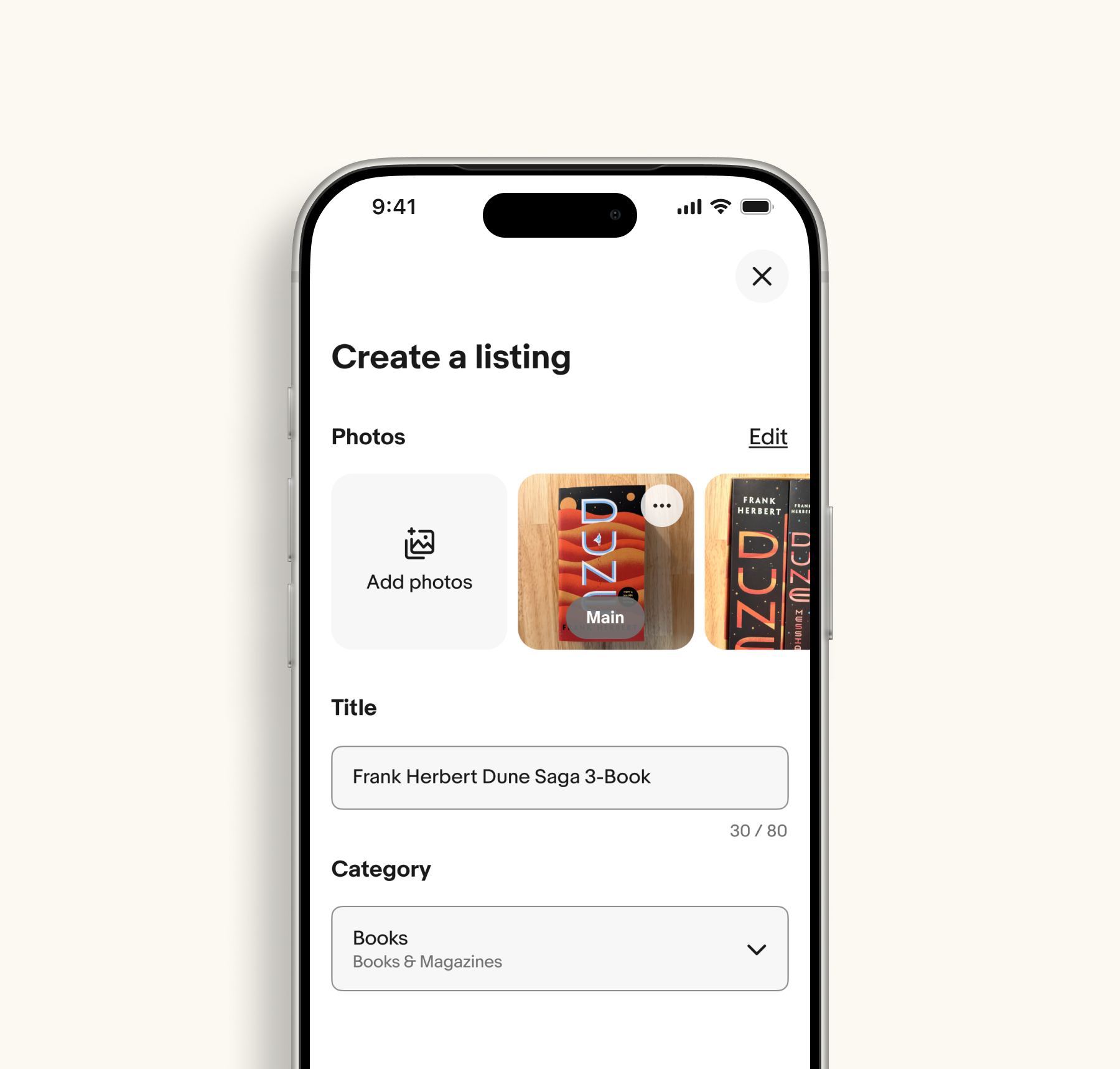

Each section of the flow underwent detailed evaluation. In many cases, 5+ features were removed from individual screens.
"Simply ask only for what matters."
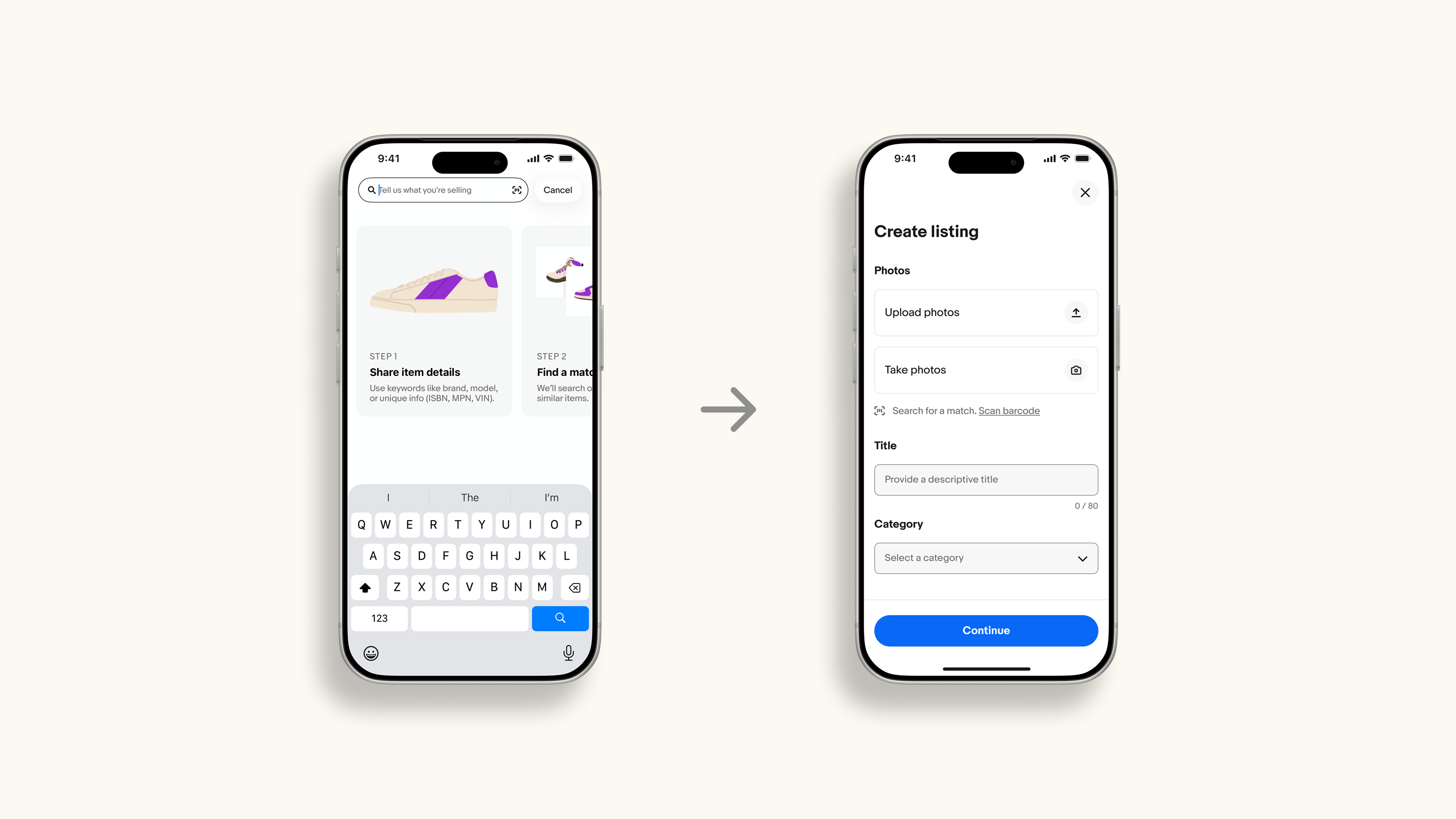
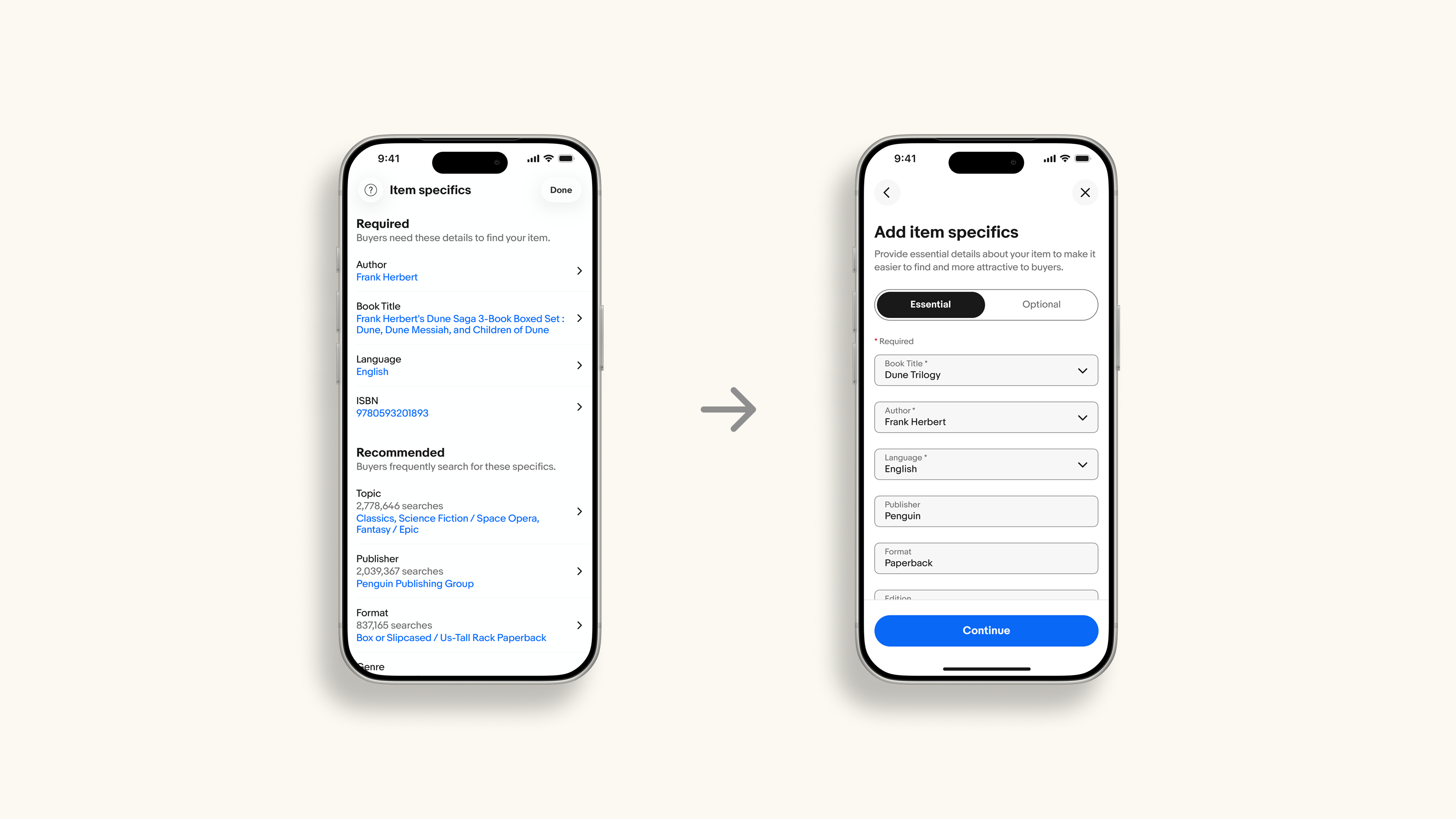
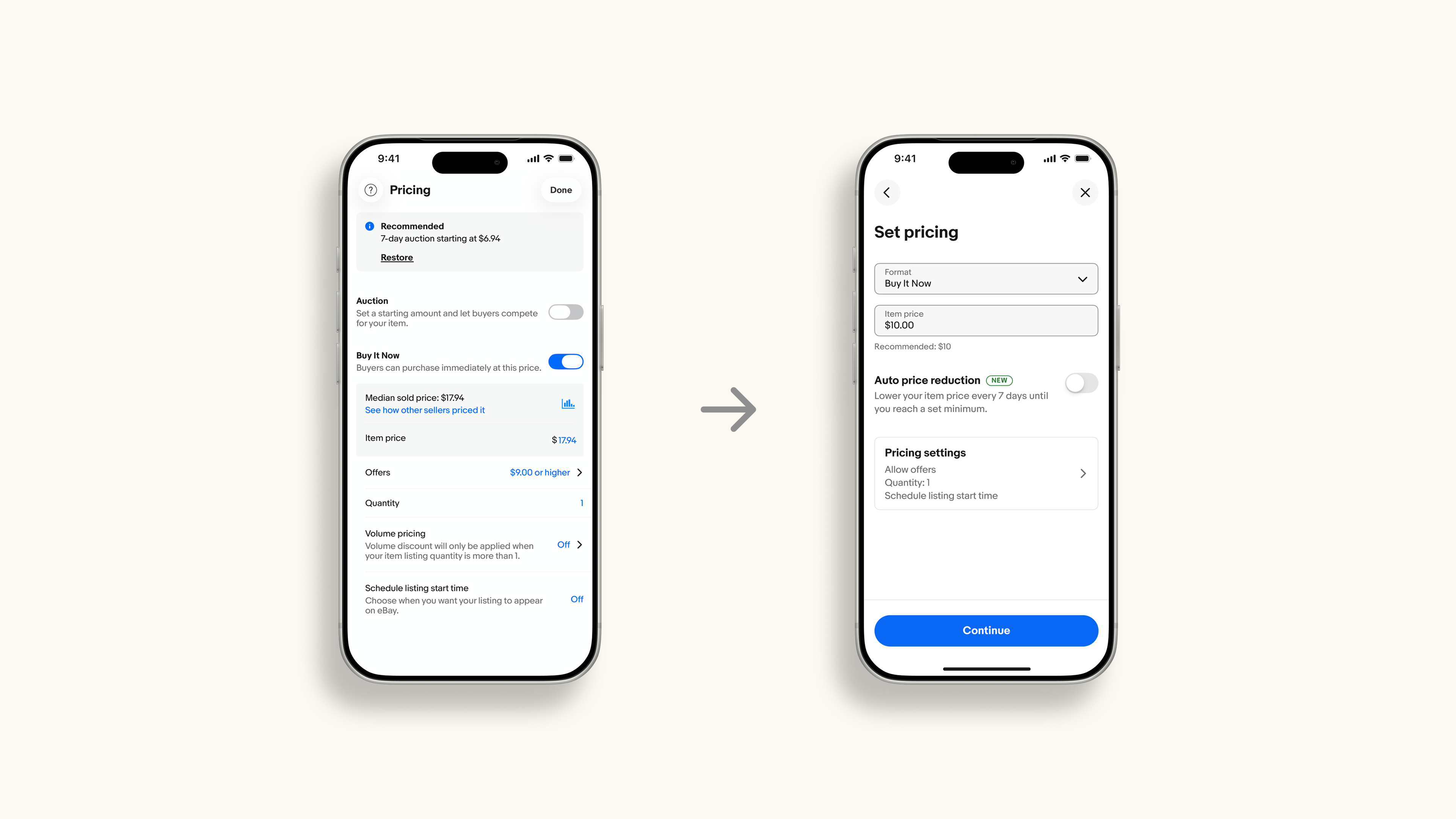
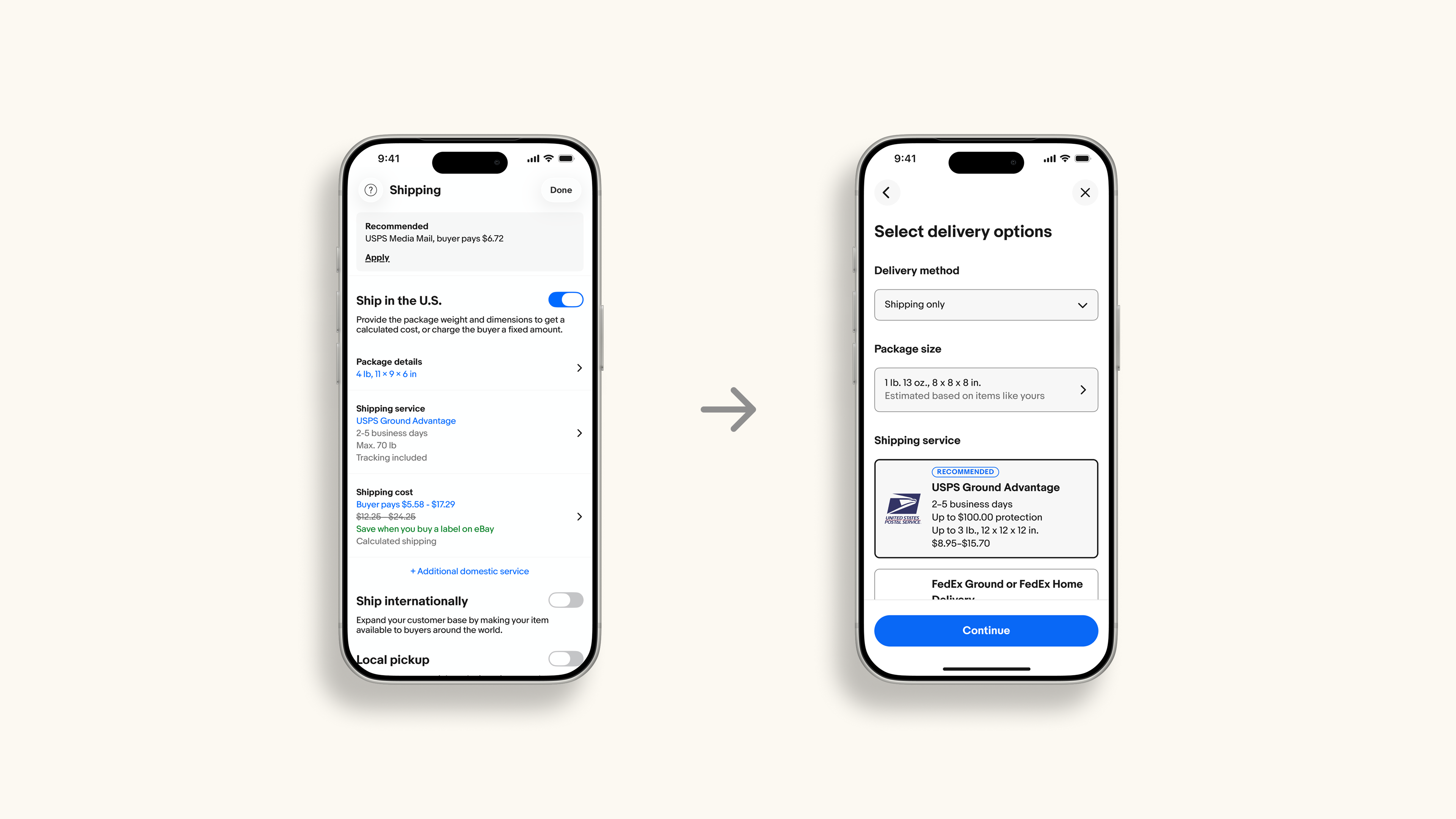
Some of the most difficult features to remove included Subtitle and Gallery Plus. Although these generated millions in revenue, usage data showed limited usage, increased friction, and low relative value compared to the complexity they introduced.
The decision prioritized higher listing completion, improved seller outcomes, and stronger downstream business impact rather than optimizing for isolated feature revenue.
Key Features
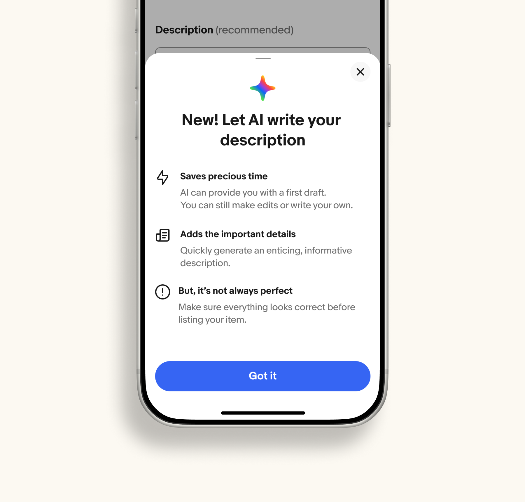
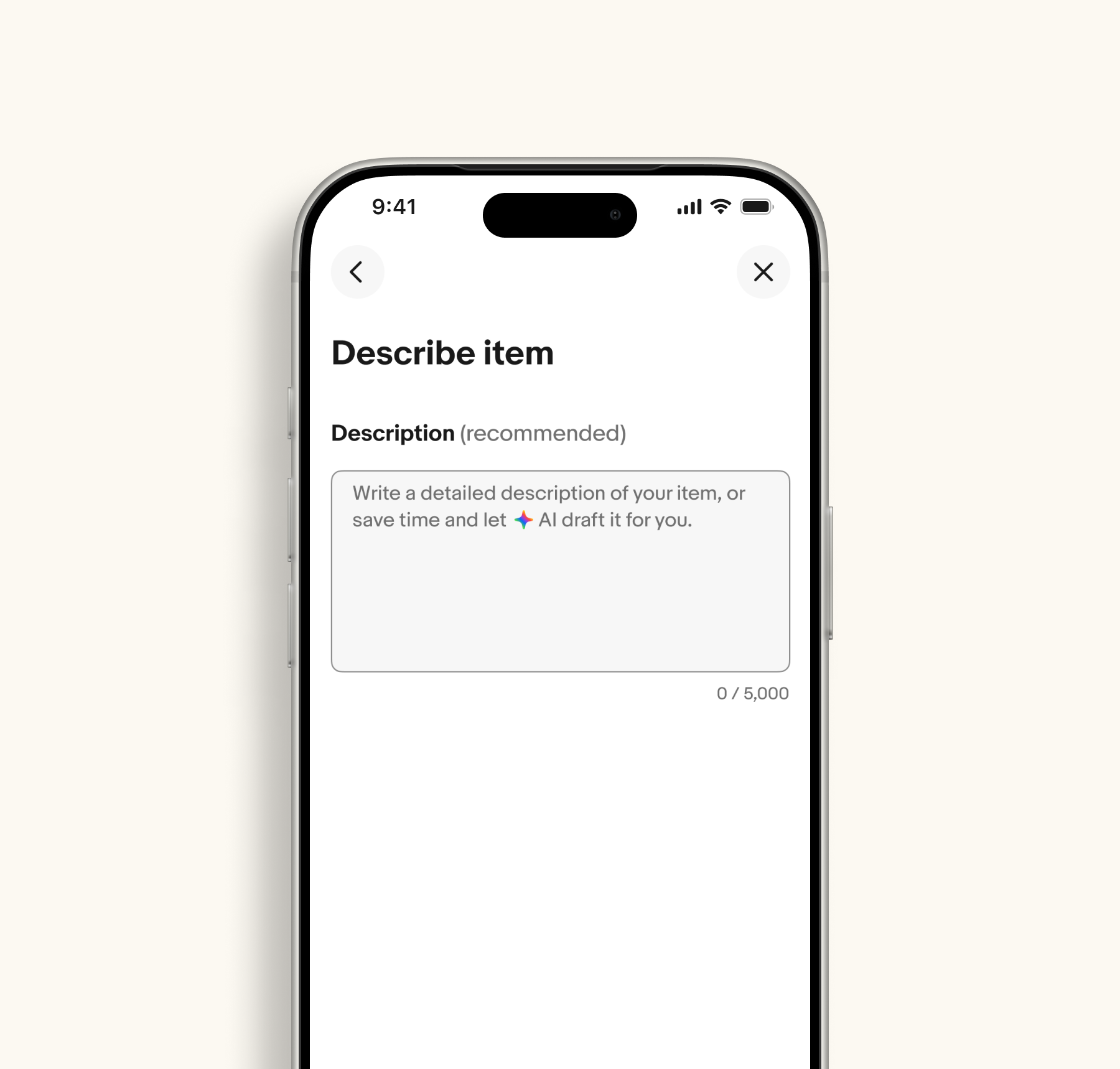
Writing a good description was one of the most intimidating parts of listing. We introduced an AI feature that auto-fills the listing description for sellers which took the burden of writing one off their plate while still letting them review and refine before publishing.

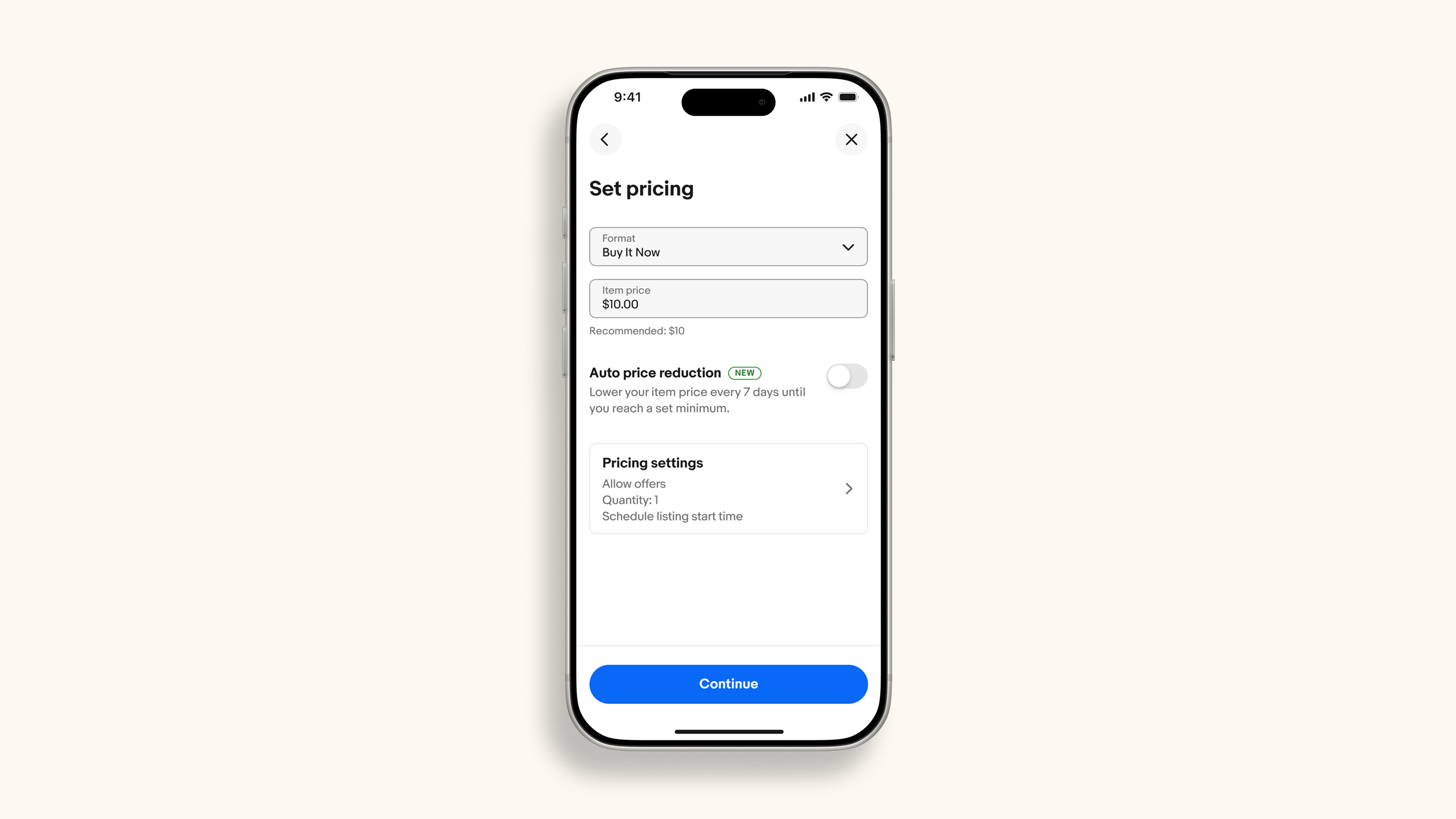
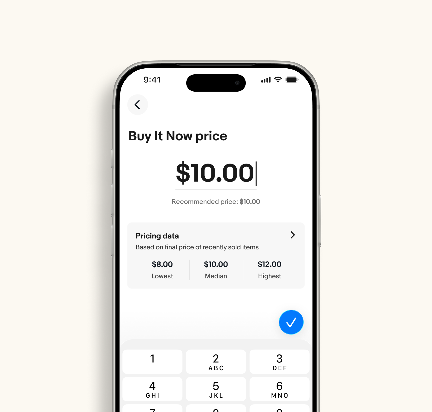
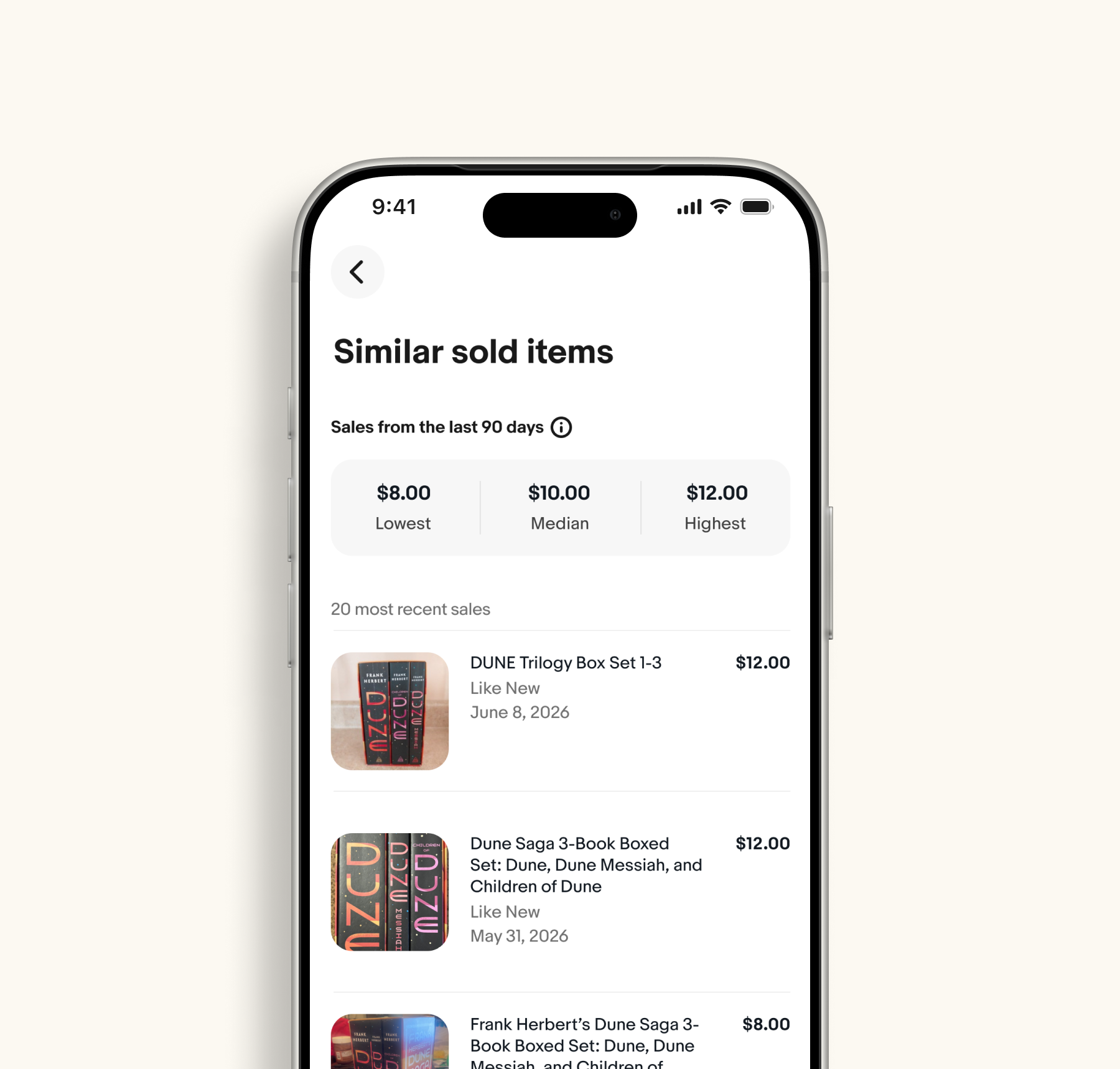
We simplified the pricing experience by reducing features and refining the UI for a more intuitive flow. We also added price guidance that can auto-fill the median price and shows sellers exactly where that number comes from, drawing on comparable eBay listings so they can price with confidence.
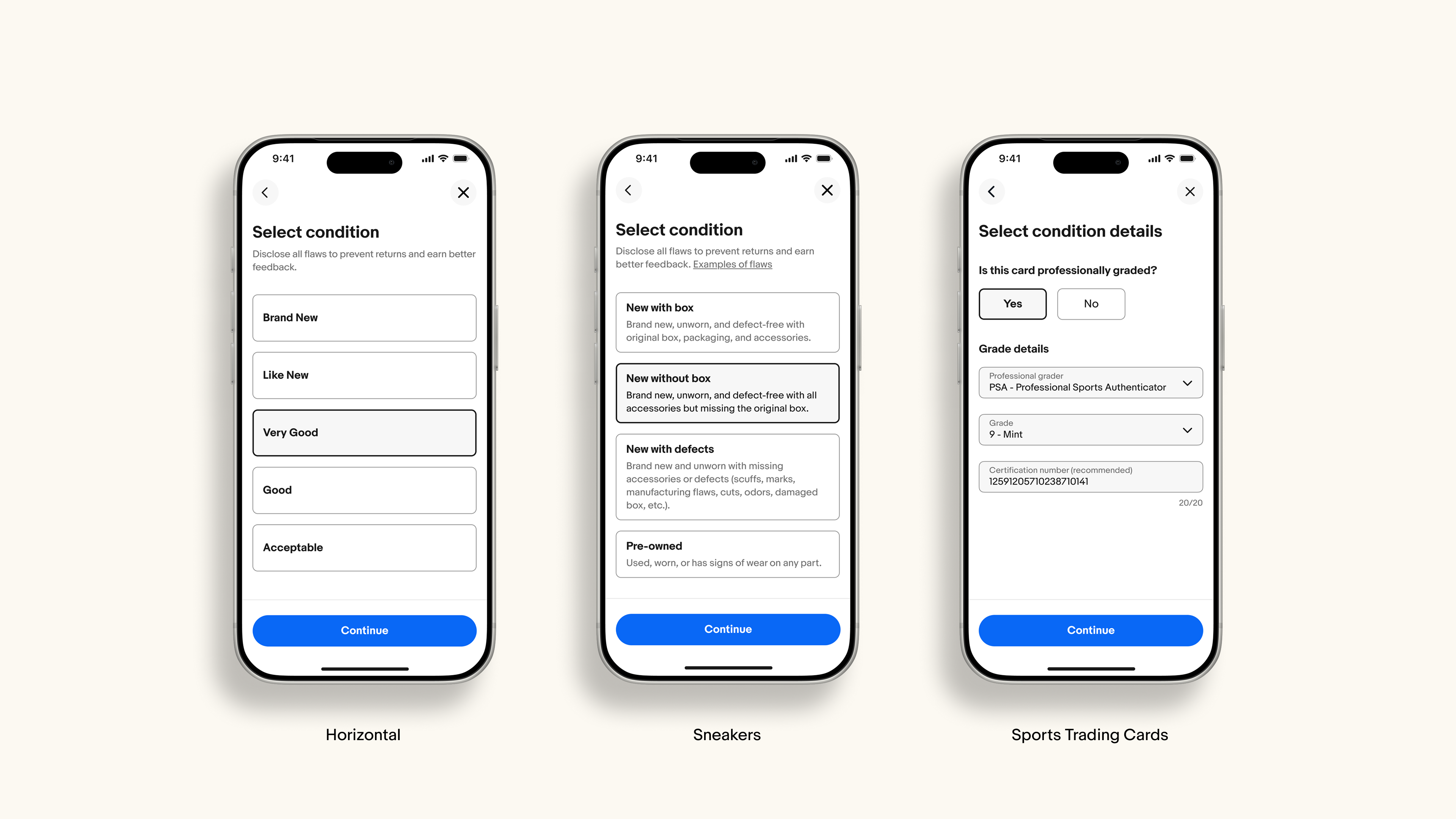
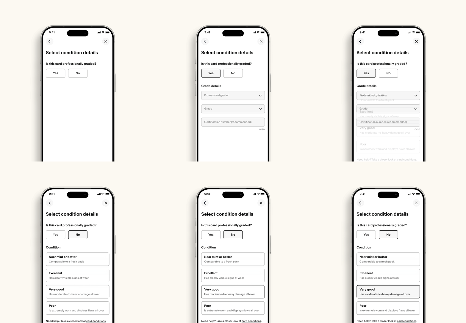
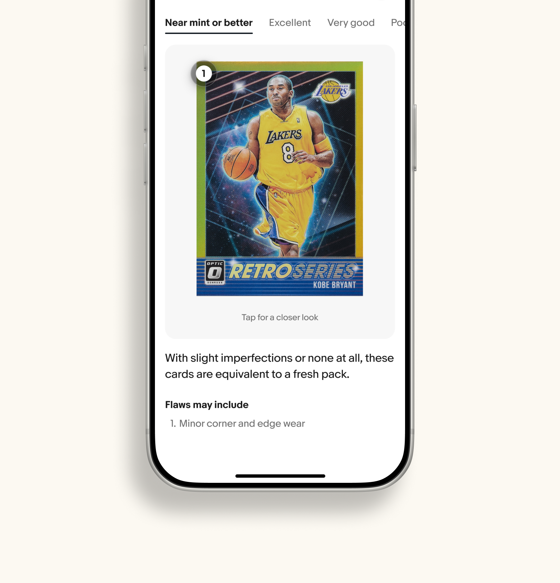
Condition used to largely be a one-size-fits-all choice where the same options applied to every item, regardless of what it was. Now sellers can specify the condition of their unique item and get the category-specific guidance for eBay's focused categories.
Experience Principles
No. 1
Use every seller input to infer additional information.
No. 2
Only ask for information that cannot already be inferred.
No. 3
Keep complexity behind the scenes and not be the burden of the user.
Impact
Reflection
This project reinforced that simplification often requires removing things rather than adding them. The most difficult work wasn't designing new features, it was identifying what could disappear while balancing user needs, business incentives, and organizational priorities.
It also taught me that simplification only works when the systems behind the experience are trustworthy. Even the simplest interface breaks down if the underlying data creates doubt.
Happy to talk through the process, tradeoffs, and what I'd do differently.