Case Study · AT&T
Repositioning a traditional brand as unique, youthful, energetic, and vibrant
Challenge & Solution
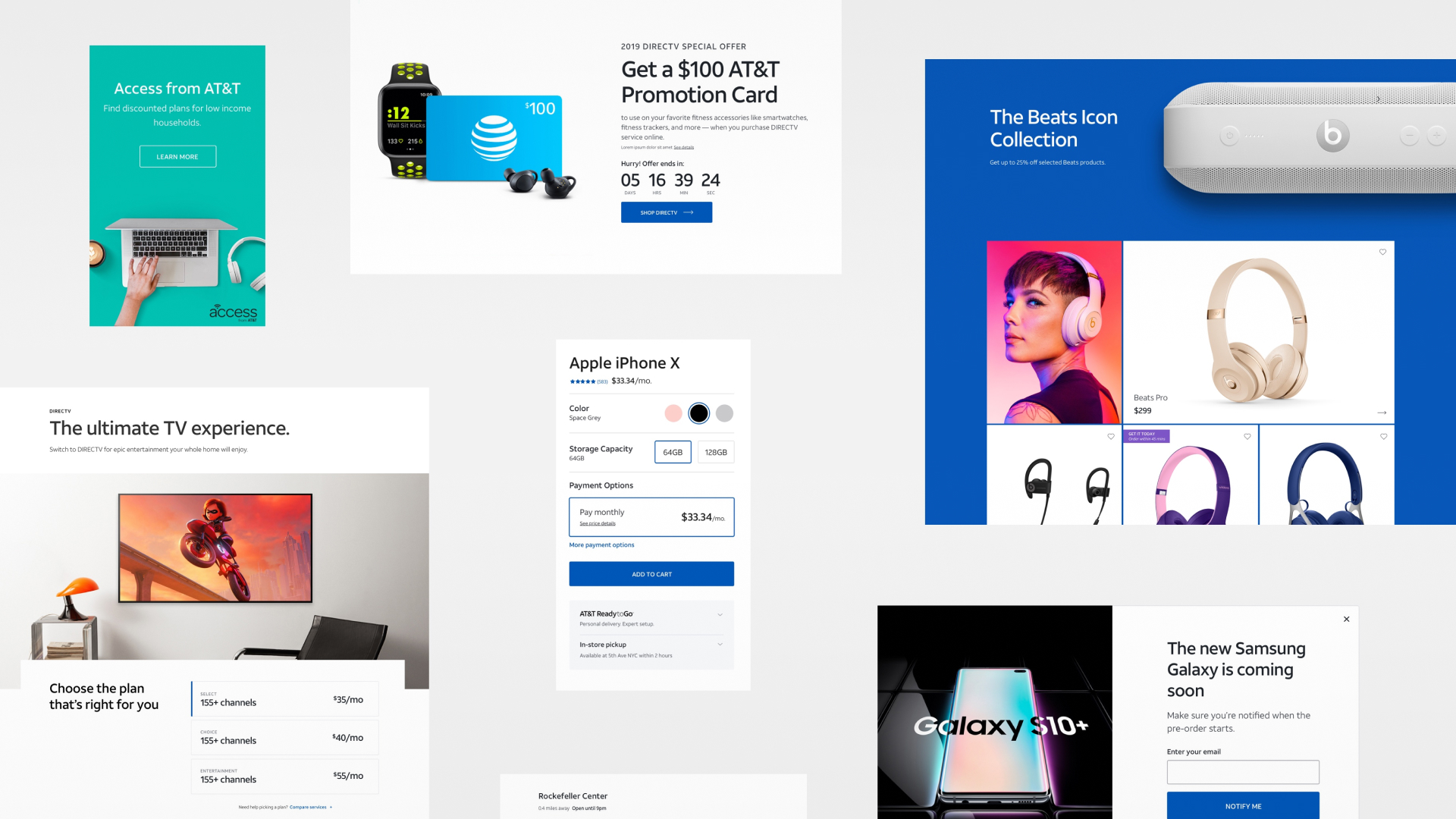
Viewed as an older and traditional brand, we sought to redefine who we are and reposition ourselves within the market as unique, youthful, energetic, and vibrant.
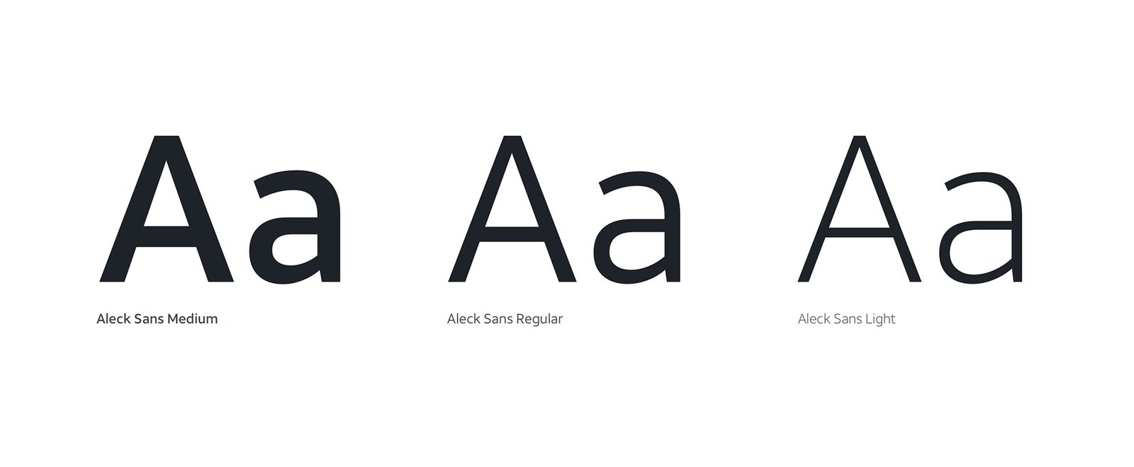
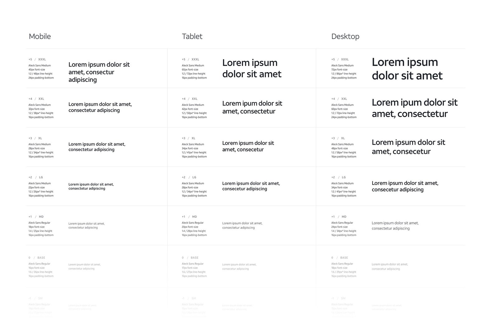
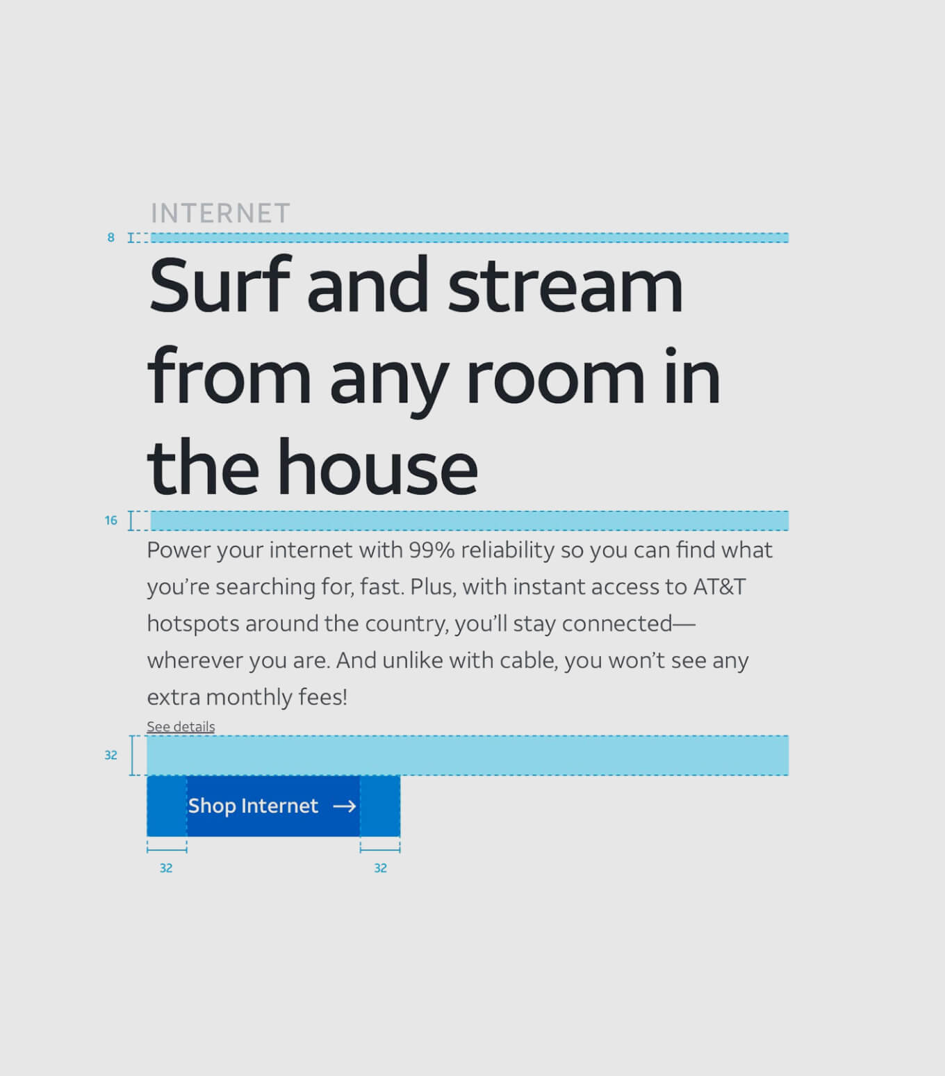
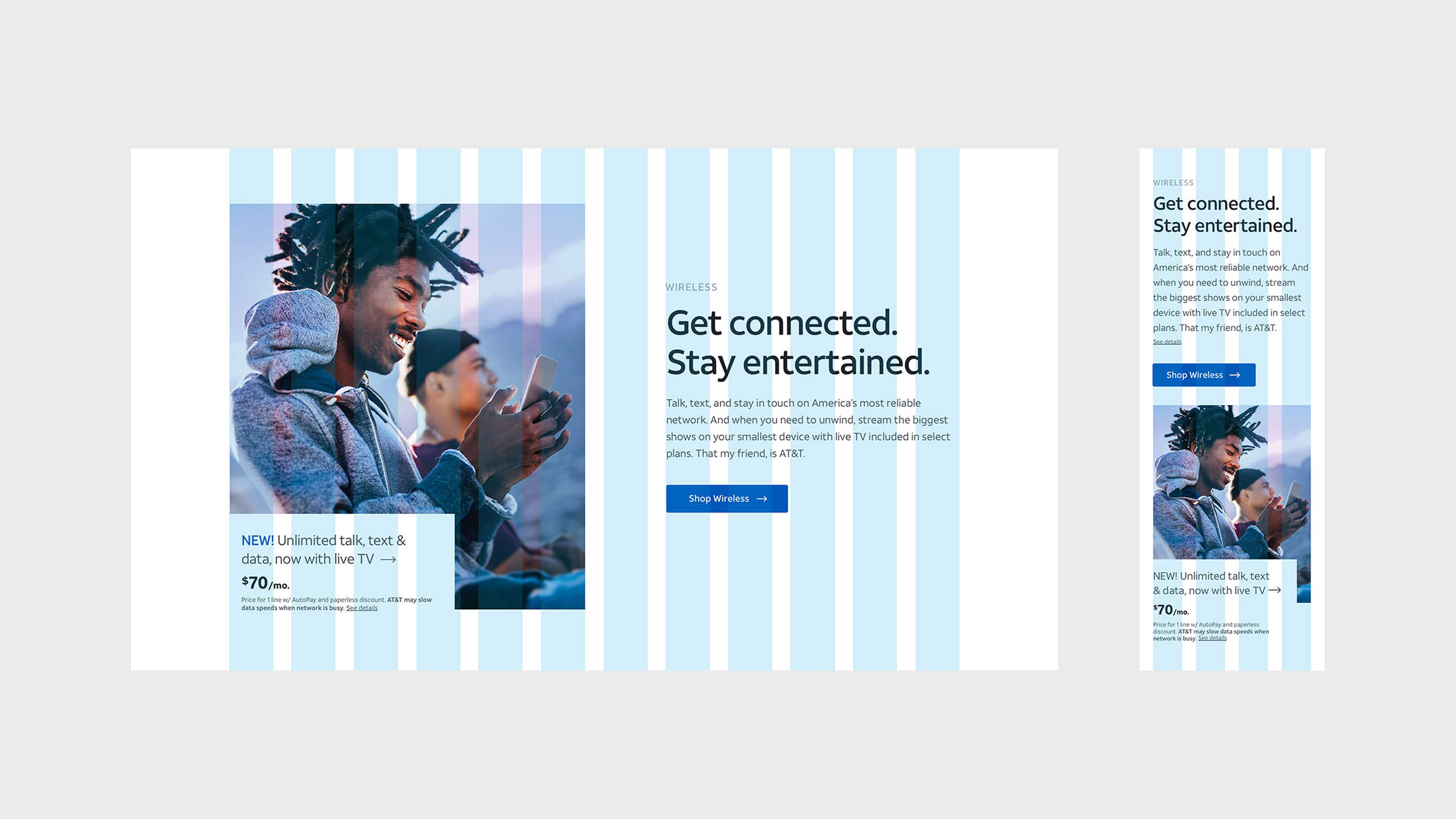
Working closely with partner teams, we looked to the core elements of a brand — color, typography, and photography — to evolve our overall look & feel and find new and fresh ways to express ourselves and the value we bring to our customers.
Guiding Principles
01
Integrate look and feel purposefully with function. Consider the audience and tailor experiences to their needs.
02
Define clear goals for every experience, page, and component. Minimize cognitive load so users aren't overwhelmed by too much information or too many choices.
03
Build frameworks and content for mobile first — mindful of limited space, short attention, and performance. Then optimize up for larger screens.
04
If it doesn't serve a clear purpose, remove it. Be able to explain what every element is for.
05
Root interfaces in familiar human interactions. Draw from physical affordances and use conversational, context-appropriate language.
06
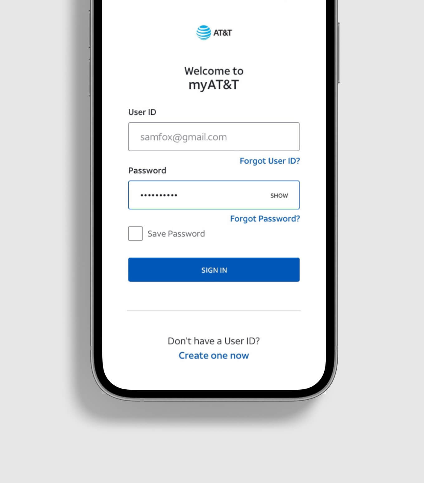
Design for everyone. Respect common conventions and apply basic accessibility principles rather than over-designing.
07
Create premium, easy-to-use experiences. Use negative space to keep pages light and airy, and apply color with control.
08
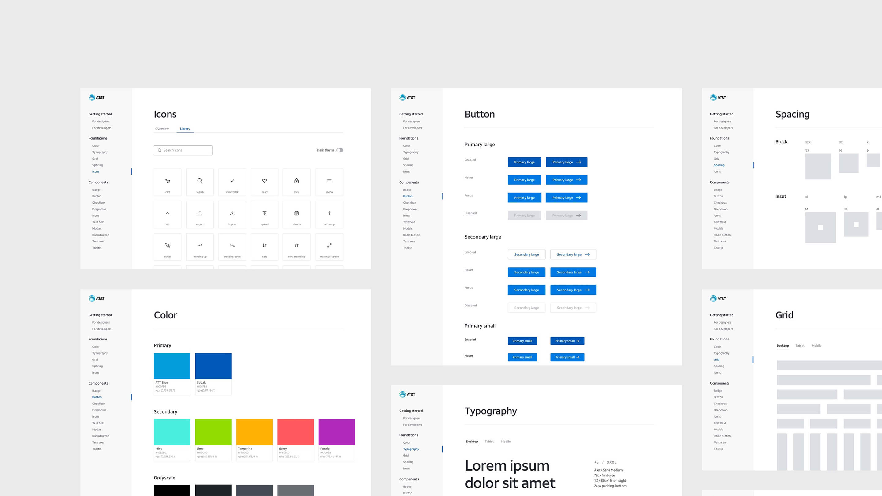
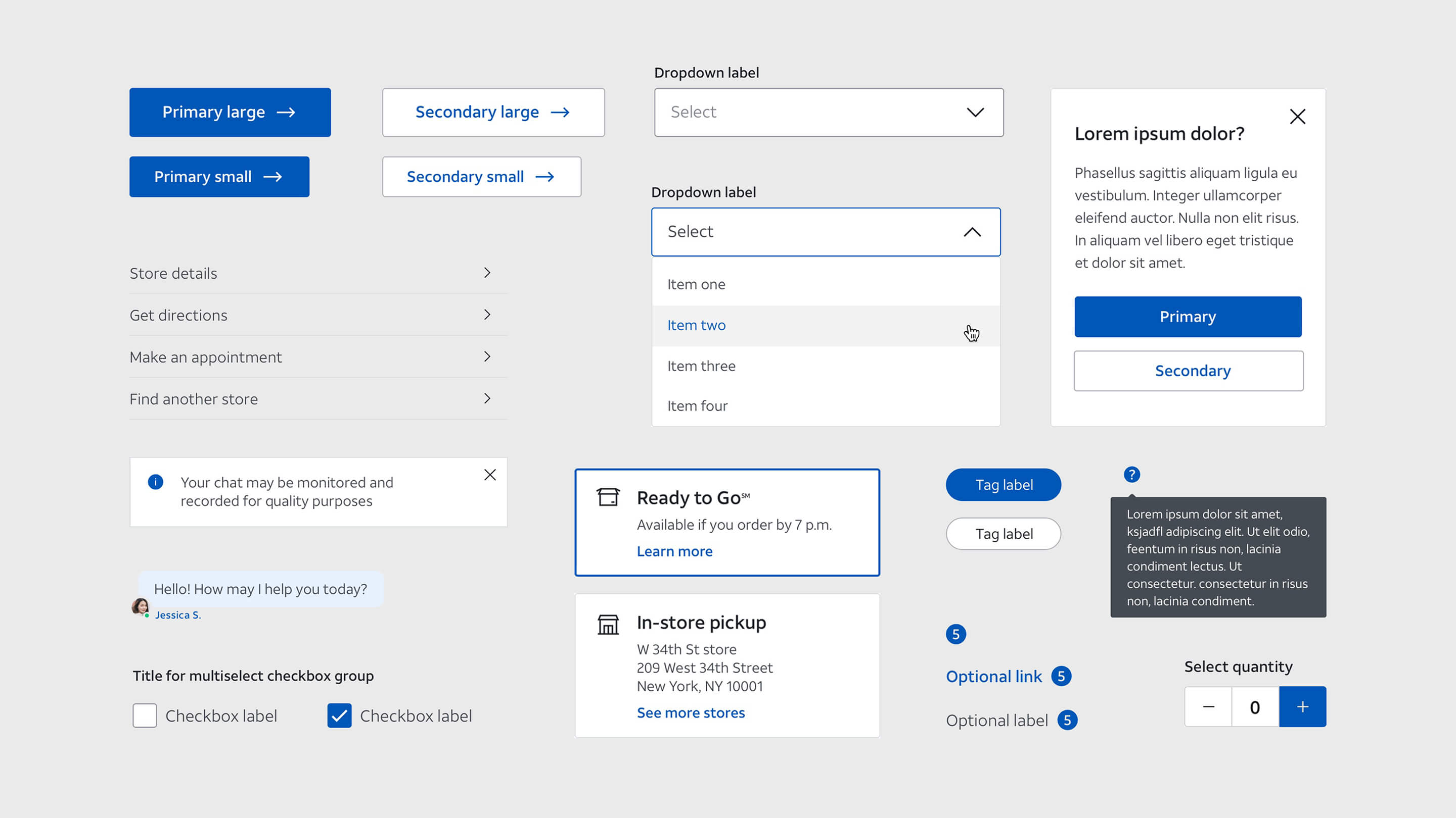
Provide features and behaviors people expect. Use system elements for components, icons, CTAs, text styles, and consistent terminology.
The Work

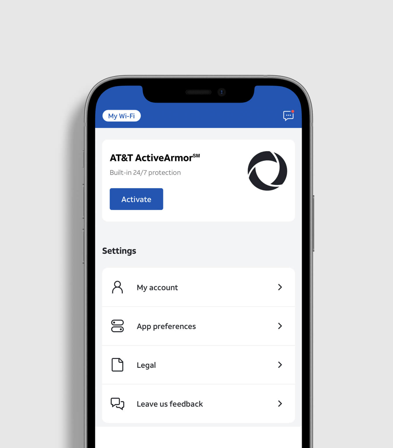
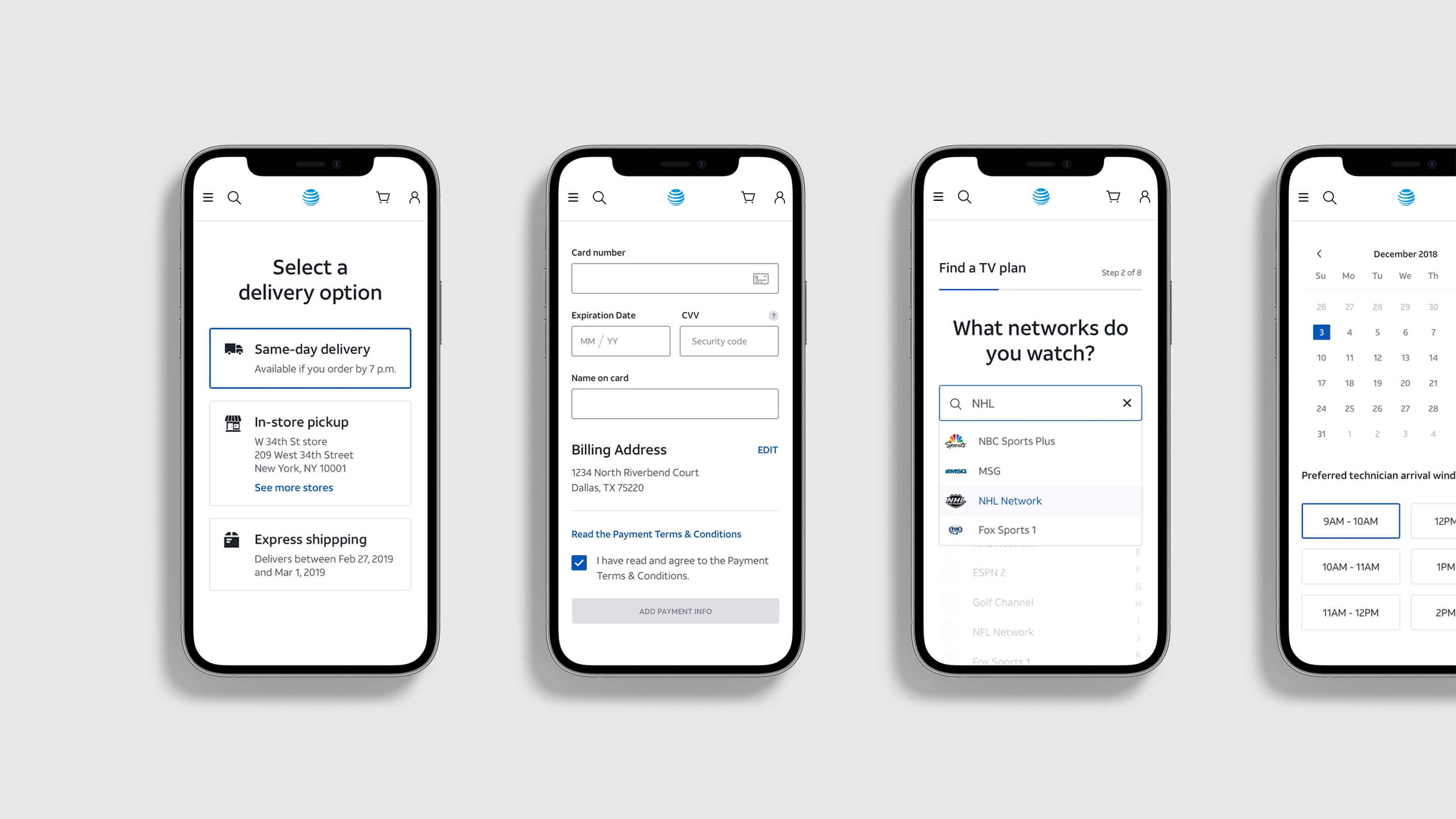
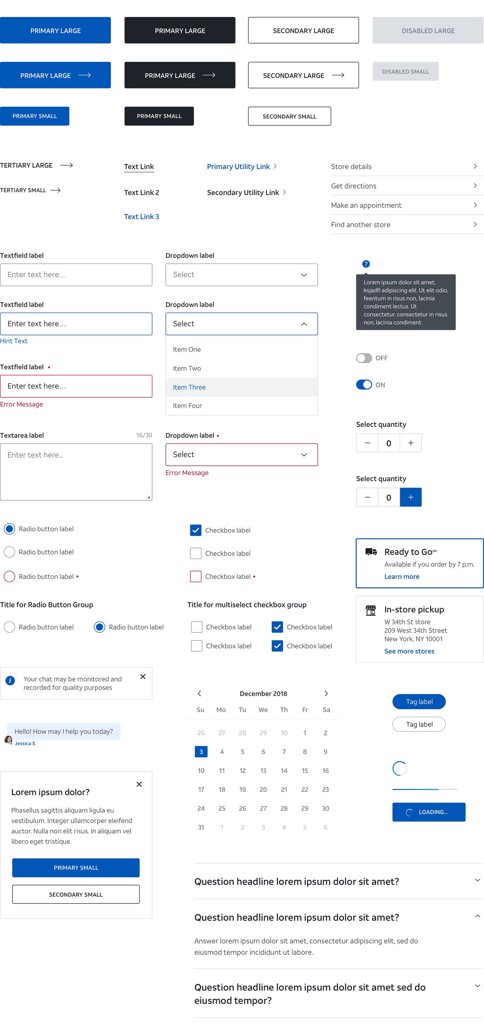
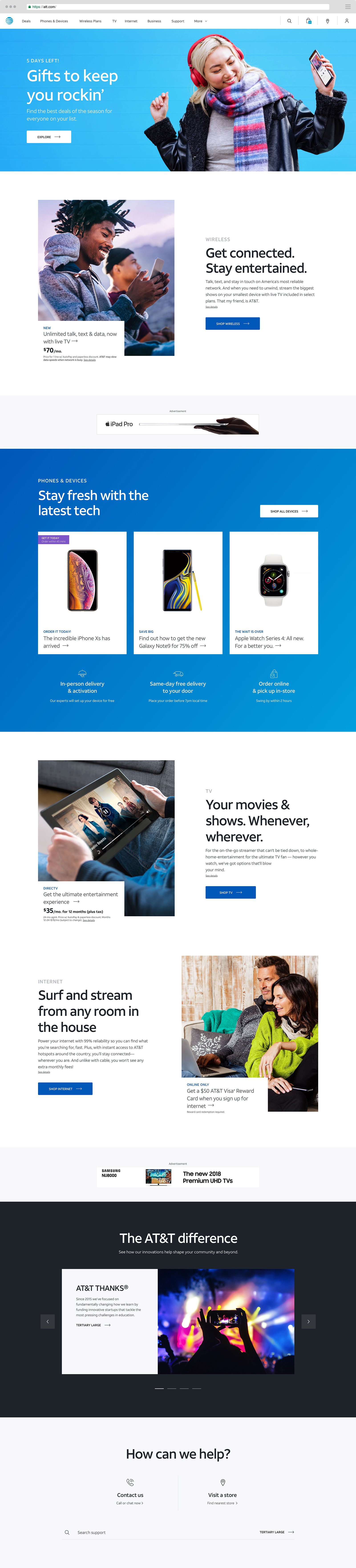
Happy to talk through the process, tradeoffs, and what I'd do differently.